I’ve had occasion to review a lot of applications recently for a content design job. Naturally, many folks want to move from more traditional content fields like marketing or communications or web content management into newer, UX-coded roles like content design or UX writing. You might even be one of them!
I believe strongly that you don’t have to have a job on your resume with UX in the title to understand UX or have experience in it. I believe strongly that writing can be practiced as a form of design. I believe strongly that there’s much more to writing than simply banging out some words.
But. But.
The thing about UX experience and design knowledge gained without an explicit UX background is that it’s not something I can assume. I can hope or believe that you have that experience or knowledge, but you still have to show me.
This is where portfolios and case studies into play. It also brings us to what I really wanted to share with you today: A recommendation for a great, relatively simple method of adding a UX deliverable to your content design portfolio. It goes by many names, but the one I’m going to use is this: heuristic experience audit.
What is an experience audit?
You’ve probably seen one even if you don’t recognize that particular phrase. Let’s take it word by word.
Heuristic – In design, you can think of a heuristic as a super-duper well-verified best practice. Best practice tends to mean “what it seems like everyone else is doing”. Responsible designers, meanwhile, reserve the word heuristic to mean a principle or guideline derived from extensive hands-on experience, synthesis of existing research, or even the adaptation of higher-level principles from disciplines like cognitive psychology. A popular set of heuristics are Jakob Nielsen’s 10 Usability Heuristics. You could also use the human interface guidelines for a particular platform as your heuristics, as your rules to evaluate against, such as Apple’s Human Interface Guidelines. Heuristics are not a substitute for doing your own substantive user research, but they are a wonderful improvement upon merely guessing or just doing whatever the CEO suggests. If the brand or company you’re using as an example has a public design system, like Adobe’s or Intuit’s, that’s a good reference point as well. (I wouldn’t exclusively rely on the style guide, especially if it’s for the company you’re applying for … however well-documented it may be, voice and style are still subjective things, and there’s a chance you’ll miss the mark.)
Experience – In this context, we’re talking about a user’s experience of trying to accomplish a task within a digital experience. It’s the user’s literal experience of the software, possibly across multiple channels such as email, the web, and a mobile app. For your first try for a portfolio, you might want to stick with an experience within one specific channel … mobile apps are great for this.
Audit – An audit is an inspection or evaluation against a set of criteria. For our purposes, you’re auditing (inspecting, evaluating) a user experience based on a set of design heuristics or principles. (Audit also tends to imply an outsider’s perspective, which is exactly what we’re talking about here.)
Let’s put it all together: A heuristic experience audit1 (or UX audit for short) is a method of inspecting the user’s experience of a product against a set of guidelines or principles.
In my own work, I often conduct a UX audit right out of the gate after starting work with a new startup client to give them an idea of how I think and what kinds of insights they can expect from me during our collaboration … which is precisely what a prospective employer is looking for, too. I’ll also often throw in a quick, two-hour-or-so UX audit of a client’s website on a content strategy project, which sometimes ends up being the most popular piece of work out of an entire six-month engagement!
The reason I like UX audits in content design portfolios is that they focus on you and your approach to design thinking: what kinds of things you tend to notice, how you articulate your thinking, and how you frame questions and design recommendations.
You don’t have to have the answers, just insights
UX audits are not about coming up with solutions — which is almost always a collaborative process on a product team, anyway. The audits are just about the perspective that you bring to the table.
Too often, portfolios are full of “before and after” screenshots with very little storytelling or any perspective on how you, the candidate, contributed to the process. Before and after copy, without any of the context or analysis that I’m talking about here, can’t tell me whether or not you “get” UX design. It’s just more writing in a different context, which, you know, good start, but we can do better.
Another reason I like this approach is that project and UX outcomes are too often out of your control as a content designer, especially as a junior or mid-level designer. So the well-intentioned, formulaic portfolio advice about outcomes and results doesn’t always work for people who don’t get to own their own projects. I want your portfolio to be full of your work, your ideas, your thinking. Show me what you’ve got.
There’s nothing about a UX audit that requires you to work for the company who designed the experience, and no special knowledge required about their goals or business needs. All you need are:
- an understanding of the user’s goal or task (which you can draw from your own experience or guess at based on marketing claims),
- a good guess at the business goal/need (often direct revenue, conversion, reducing support inquiries, etc.),
- documentation of said experience (such as lots of screenshots) to evaluate,
- and a set of principles to evaluate it against (I’ve already given you two to work from).
Conducting a UX Audit
I wrote about this on LinkedIn initially, and a few folks responded with links to example audits. I also have some examples below. Everyone does these in different ways, but hopefully I’ve inspired you to dig a bit deeper and come up with your own approach. My general method is this:
- Take a ton of screenshots of an experience that could be improved.
- Organize the screenshots in a flow that resembles how a user would go through it.
- Highlight and annotate problems and opportunities across the flow.
- Relate my observations to a set of heuristics or principles for a bit of back-up so it’s not just my opinion. (You don’t see this as much in my examples, as I took more of an expert analysis approach. But if you dig into the details, you’ll see that I am very often just highlighting options or possibilities, and if I do suggest a very specific correction, that’s generally tied to a principle I could find a reference for if needed.)
That’s really it! Do that for a flow, add 15 or 20 comments, tidy it up into a nice little presentation, and you’re off to the races. If it takes more than a day you’re trying too hard. Good luck!
UX audit examples
First, let me beg you to read the above article before trying to copy the approach that you think you see in these examples. The context is important, and some of these examples are close-but-not-quite-exactly what I was describing above. Okay? Okay.
And in case you haven’t read my other writing about portfolios, let me say that I believe your portfolio should be a presentation. In other words, make a slide deck, with Keynote or Google Slides or Powerpoint. Organize it sensibly, with clear sections and a good pace and flow, with context on each slide. Don’t just put the designs and deliverables in a lump and hope people will read every detail of them — you don’t need them to read every detail, you need them to understand why they’re looking at what they’re looking at, and what it says about you as a designer. If they’re very interested in you, or in a particular case study, sure, they might dig in and read the details, and you can include larger files or images in an appendix, if you like, or link to them from your portfolio document.
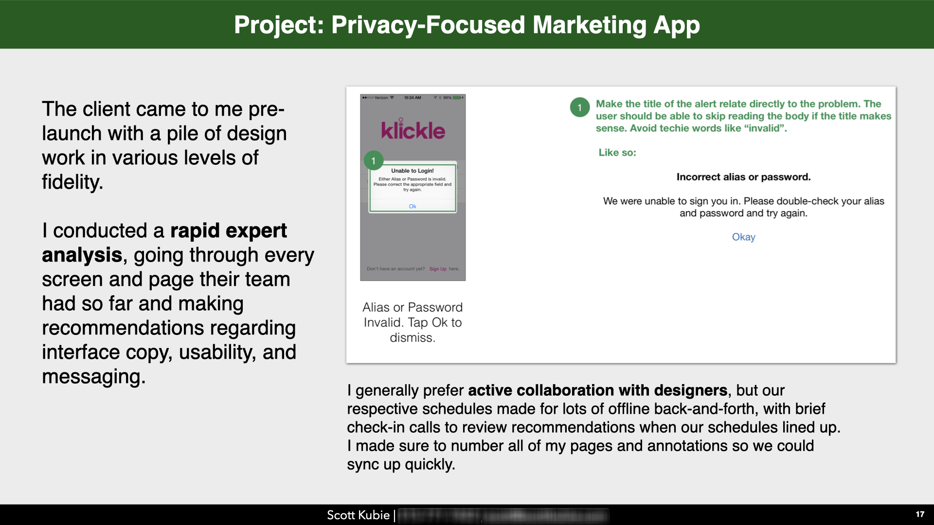
Example: Some of my own work on Klickle (RIP), a privacy-focused marketing app
Okay, so very early in my career, I did a bit of freelance UX work for a marketing and coupon app with a laudable focus on user privacy called Klickle. This was actual client work, not for a portfolio, but I did use some of these examples in my own portfolio as recently as applying for my job at Mailchimp. So I wouldn’t necessarily do all this the same way again, but it’s close to what I’m getting at.
These examples have more copy than I would probably do for a portfolio-focused UX audit of an alternative experience (so that it’s not moving into spec work territory), but the overall approach here to taking screenshots, framing and labeling specific parts of the experience, and then adding comments alongside is the general approach I am recommending.
These are excerpts of the actual files I used with the client…
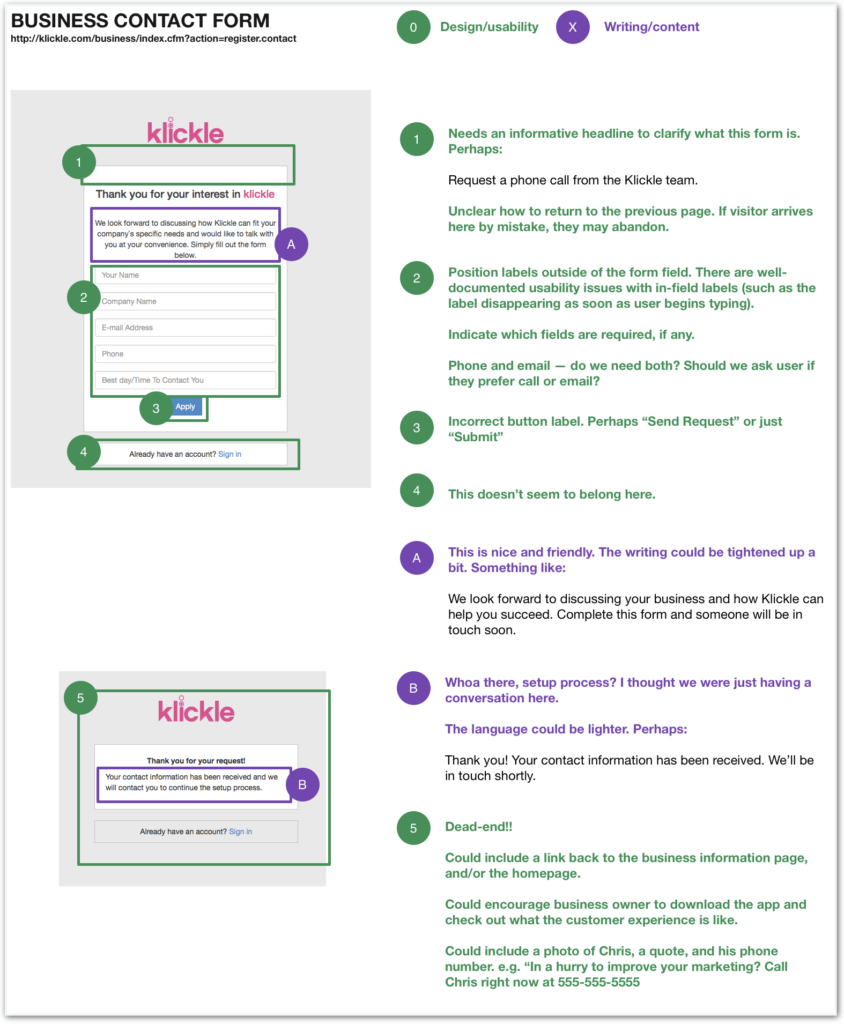
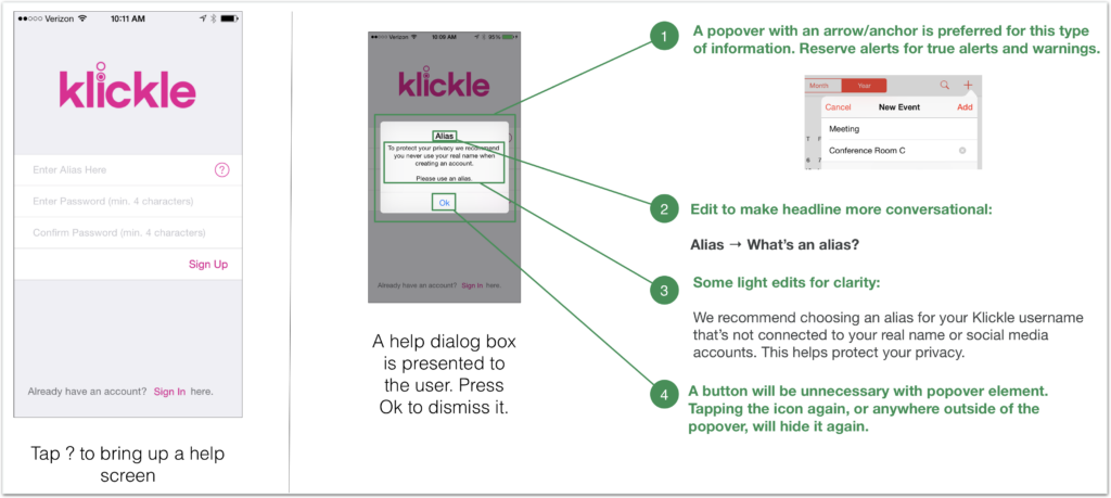
Although I had primarily been hired for my expertise with writing, you can see that the comments move between considerations of usability, readability, design, and so on. It’s writing, but it’s design. That thing we now call … content design!
In the portfolio itself, of course, I put them in context. I would tend to introduce an idea, and then put one to three further examples on the following slides, then a little more context, and so on until I’d told enough of the story.
That’s an actual slide from an actual portfolio I used to get an actual UX content job. Beautiful? No. Fancy and cutting edge? No. Just a story, with illustrations, about some work I did, in a PDF, made with Keynote.
Example: HBO Max email teardown
I wanted to demonstrate that you can do this kind of UX audit for a single moment or touchpoint, like an email, and do it relatively quickly. My comments here are focused on the content, blending together marketing, content design, branding, and UX considerations. From start to finish this analysis took about 90 minutes. And it might be overkill, honestly; you could get by with just the key recommendations at the top and the UX recommendations at the bottom. Another couple of hours to turn it into a set of slides for a portfolio, and boom, you’ve got something brand new to boost up your portfolio in a half-day, tops.
Examples from others
Designer Shirley Chan commented on my original LinkedIn post to share an example UX audit of a task on Google Maps. I like the clarity of the caveat at the beginning of her article. I also like the inclusion of specific heuristics to support the arguments. (The format is not what you’d want for your portfolio — too long and not scannable in the style of an article.)
Content designer Chee Huat Teo shared a similar example of an article-style UX audit. Again, for your portfolio, I’d consider doing something denser with all of the guidance, and then organizing it into a presentation that summarizes the recommendations and observations.
Have one to share? I’d love to feature it in this article. Send me a note with a link!
Putting it to work in your portfolio
Here are a few tips to consider as you add this to your portfolio and try out using it in your interview processes:
- Be 100% transparent about the fact that this was not work for a client or employer. Never, ever, ever lie about work that you have done. You could even link to this article, if you’d like, to further explain what you were attempting.
- Demonstrate how you would communicate if you were doing this as your job. So you may want to create a more detailed “deliverable”, as in my HBO example above, but also put together a brief presentation to walk your colleagues through your recommendations, or perhaps even pair it with a sketch or wireframe for a new email. It’s not just about showing what you know, it’s about showing how you work.
- Present it! Set the scene, both in your static, stand-alone portfolio that you’ll send to hiring managers, and also out loud with your mouth if you have an opportunity to talk about this in an interview process. Give just enough context for someone to follow along without boring them with lots of details.
- Don’t do more than one or two of these in a single portfolio if it wasn’t client work. This can be a good way to add some “UX-y” content to your portfolio, but you’re still going to want to emphasize projects from actual client or employer work if possible.
- And most importantly: Make it your own! Are you a better graphic designer than me? Probably! Style it up a bit, then. Do you have a background in research, HCI, psychology, or other disciplines? Highlight it! Show where you’re coming from. Use resources and heuristic frameworks from your own experiences.
My top tip? Jump in and try it! Many people transitioning to UX content from more traditional content roles may not be used to working visually. This is a good lightweight way to practice that skill without the complexity of doing full-on design wireframes or mock-ups. You might be surprised how quickly you take to it!
1 Yes, this is similar to NN/G’s general description of heuristic evaluation, as it uses a similar idea of “evaluate usability against heuristics”, but that method is focused more on actual production environments using multiple evaluators focused on a narrower lens of usability. Whereas the UX audit for your portfolio might highlight branding opportunities, voice and tone, and other things not necessarily directly related to usability. Ideally, it would also demonstrate some of your specific content design knowledge … content can “pass” a usability evaluation but still have room for improvement.
An earlier version of this article appeared as Issue 067 of the UX Writing Events newsletter on November 21, 2021.