
I find that I have less interest in (and time for) video games as I get older, which is too bad in a way as they are a great source of inspiration for design patterns and UX writing.
Lately, I’ve been playing lots of Ape Out on Nintendo Switch. You control a great ape escaping from simple mazes while trying not to get shot. The only controls are move, grab, and shove. It’s hard, but in a fun way. It reminds me of playing the Scout role in Team Fortress 2. You’re fragile, but powerful, and the only way to survive is to just go for it. To ape out, if you will. (I see what they did there.)
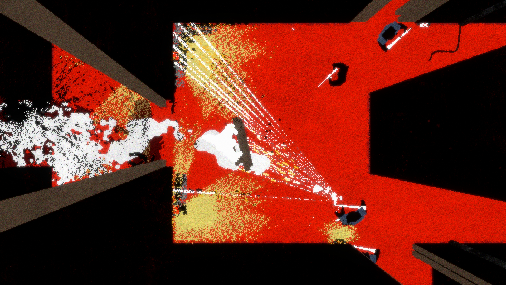
Everyone is talking about the procedurally-generated music score, which is very cool, but I think my favorite thing is just the overall minimal approach to the design. For instance:
- It keeps track of your time, and how many times you die (you’ll die a lot), but those numbers aren’t persistently visible on the interface while you’re playing.
- Level names are are integrated into the scene itself.
- New enemies and obstacles are introduced organically — no tutorials.
- There’s nothing to configure or mess with. It’s the first console game I’ve played in a while where I didn’t feel like I had to go into the settings and change something.
In a way it reminds me of a well-designed presentation. There’s just one bold simple thing to focus on at any given time, with occasional moments to rest and reflect with a bit more detail and data on the screen. The simple (and creative) color palettes contribute to this feeling as well.
My design takeaways: you don’t have to show everything you know, and sometimes it’s more satisfying to let a user try something and fail on their way toward learning it rather than trying to explain it to them first.