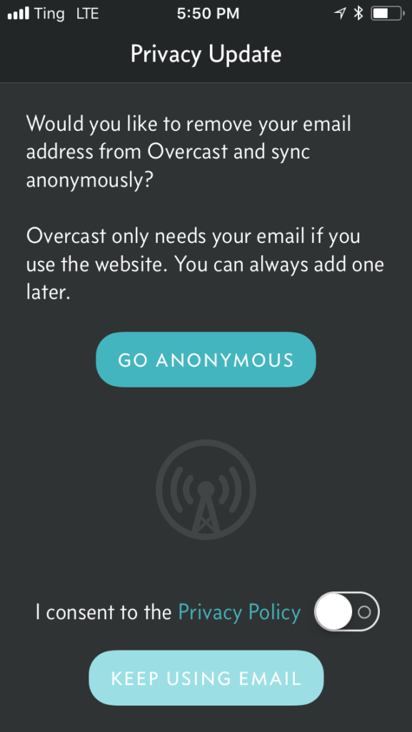
There’s a lot to like here. Clear heading. Shows up immediately, full screen. The pre-selected path (to remove your email address) adds privacy and is user-focused. It explains what the email address is for in simple language, right there on the same screen without having to go anywhere else to read anything. Love it.