I posted on LinkedIn recently a year ago (this got lost in my drafts!) after some discussion in the Content + UX Slack group about naming product features. Here’s what I shared:
Every time you name a product feature that doesn’t require a name (e.g. “My Account” instead of just “account”) you’re adding cognitive load for users, increasing difficulty for your support staff and technical writers, and adding unnecessary weight to the product that makes it harder to be nimble in the future.
Marketing loves to name things, but marketing isn’t design. It shouldn’t be their call.
Take it from a veteran of a 30+ year-old tech company that named EVERYTHING: It is a waking nightmare, and every seemingly-minor taxonomic question ends up being a puzzle, if not a full-blown battle. It’s awful. Don’t name things if you don’t have to.
The post generated some useful discussion. One thing I learned quickly: feature naming is even harder in other languages. In German, for instance, every noun (insofar as I can tell from my DuoLingo lessons) gets Capital Letters. I clarified further:
I’m talking about proper nouns versus common nouns. It’s less “My Account” versus “Account”, and more “Account” versus “account”.
An account (common noun) is an idea you can look up in a dictionary. But some companies decide to brand generic features like this, and name it something like “My Account”, and further require that tech writers and marketers always refer to that feature as “My Account”.
This kind of unnecessary branding forces writers into more awkward and cognitively-taxing constructions than they would have otherwise been able to use.
James Sanford pointed out the tangential issue of Your/My confusion in software interfaces. I linked him to my favorite article on this about the WYLTIWLT test. Katherine Sanderson Grey asked for the data, and challenged me to describe how I persuade leadership that branding features is problematic.
That’s a good challenge! I don’t use data for these kinds of things. In my experience, “show me the data” is often a tactic employed by weak managers who don’t know how to hang as part of a design process. Anyway, the general question of rhetoric around this is an important one, and I’ll share more about it in a minute. Her comment also helped me articulate the category of unnamed features. She writes in part:
All features have to be called something, either internally or in the documentation for customers.
Yes! All features do have to be called something. But sometimes a chair is just a chair, and not, for instance, an Eames Lounger. I recommend documenting your product taxonomy internally, but that doesn’t mean that everything has to have a fancy, complicated, unique, proper noun name.
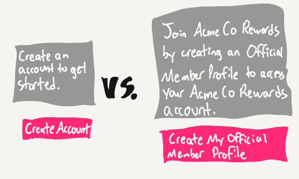
Okay, so “selling it” (the it being “not naming things”) and stakeholder management: As a member of product teams, I’ve generally addressed the “this feature needs a name” argument directly, by modeling and visualizing the difference between communicating about Named Features vs. Unnnamed Features.

A quick mock-up of both versions of the CTA, interface element, tooltip, or documentation in question often makes it clear that unnamed features are more elegant and user-friendly than named features.
I’ve also found visualizing the content model or taxonomy to be helpful in some circumstances. For instance, drawing a picture that shows that the thing we all know internally as the “Paid User Account” will always be referred to as a “membership” in customer-facing text, and that they are in fact the same things and we’re not creating two different things.

Proper Noun Feature Names creep into the product when we’re forcing users to do work instead of doing it ourselves. Instead of documenting our vocabulary internally, we’re turning the product itself into a glossary. Instead of making workflows intuitive, we’re indexing and labeling everything so that we can shunt the work of explaining how it works off to customer service, and by extension, the customer.
This is user-hostile, bad, lazy design. Don’t name things if you don’t have to. Do the work. And keep it simple, Scott.