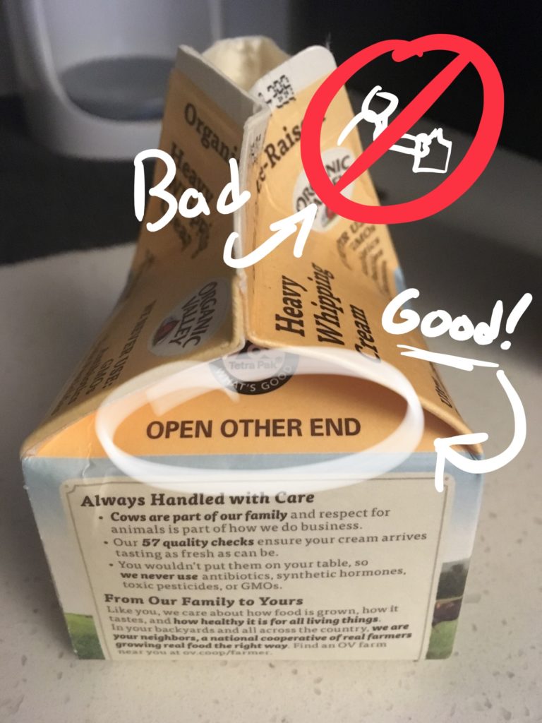
I like when designers solve problems with words in a straightforward and simple way.

I nearly opened the wrong end of this carton of heavy cream. But then I saw the all-caps instructions to OPEN OTHER END. So I did.
Not hard to imagine a designer using an illustration (which you’d probably decrypt right after screwing it up), or trying to redesign the carton so that the user is inclined to open the correct end. Or to design a new package where opening either end works. But you know what? This gets the job done, cheaply and simply.