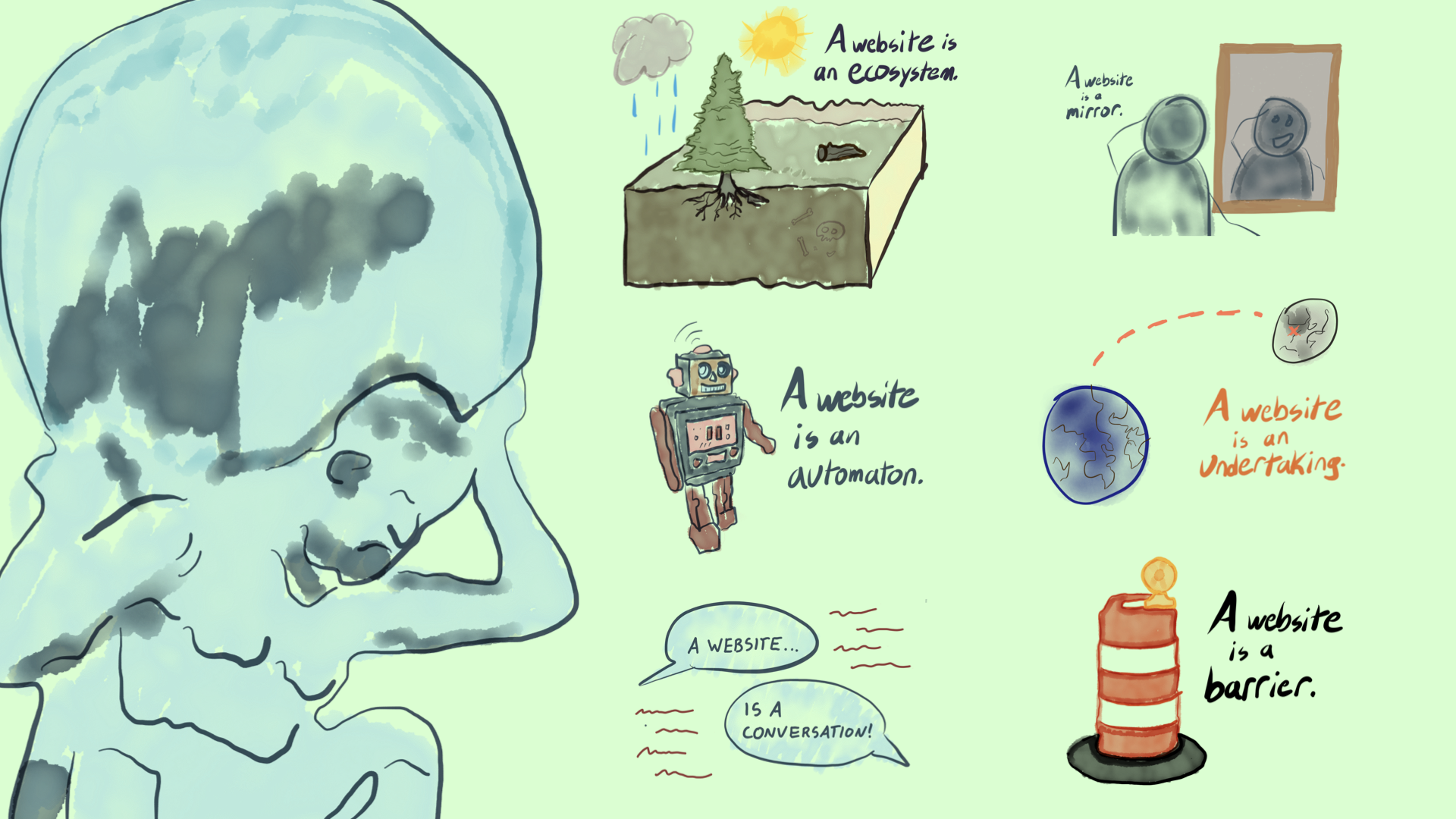
I got to revisit my 2018 World IA Day Des Moines keynote this weekend for World IA Day Providence.
Since this one had 6 years of dust on it, I wrote out a lot more than usual in my speaker’s notes. Which makes it easy to recreate for you here now. Enjoy.
Good morning. I’m really happy to be here. My name is Scott Kubie. I live about 7 minutes thataway, on foot. I have a question for us today. It’s a question with a lot of answers:
What even is a website?
I first gave this talk in 2018, so I didn’t expect it to be timely when I pitched it a few weeks back…
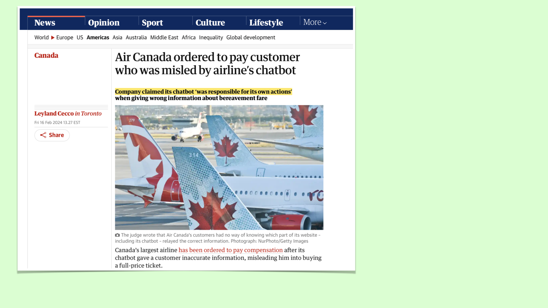
But it is! Air Canada was recently reminded that everything on their website is their website. They didn’t want this to be true. Their chatbot gave incorrect information to a customer about bereavement fare policies.
The customer believed the chatbot — because why wouldn’t they? — and acted upon the information. Later, the company argued, in so many words: “You can’t blame us if the chatbot misspoke.”
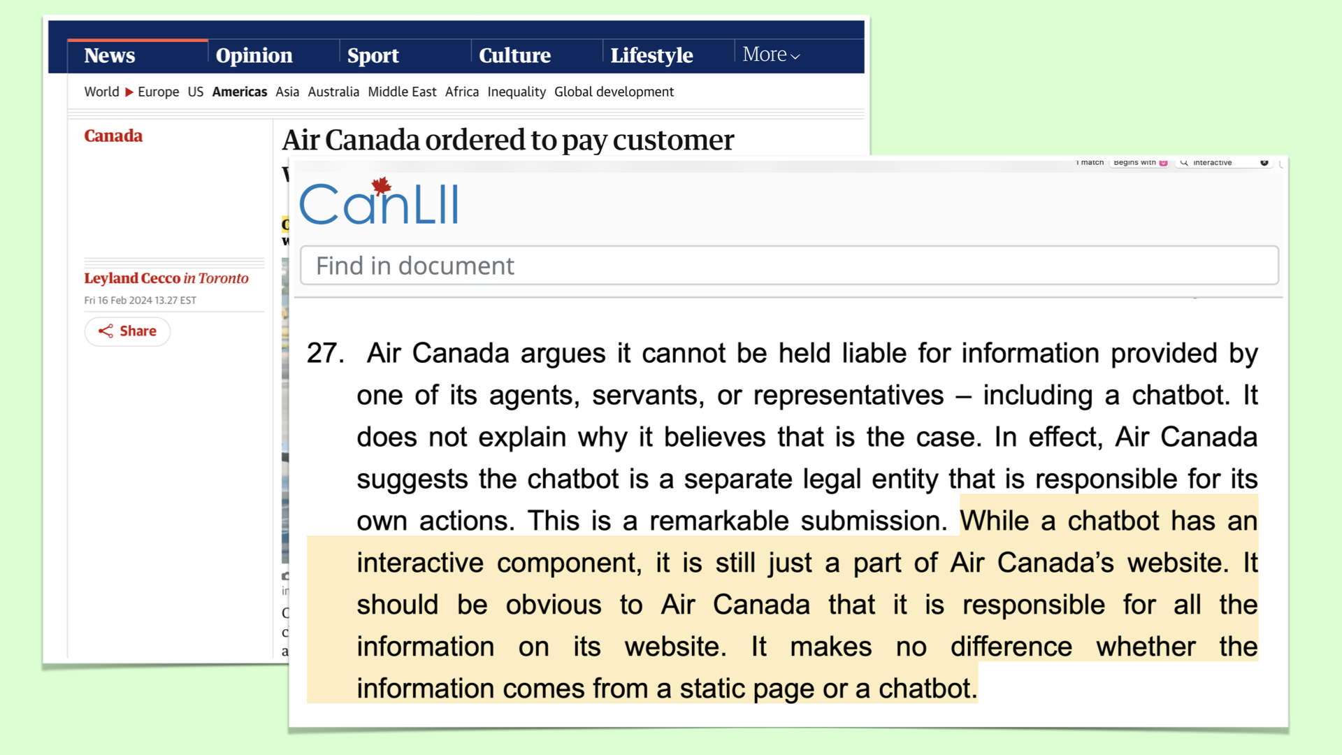
It went to small claims court, and the tribunal remarked:
“Air Canada suggests the chatbot is a separate legal entity that is responsible for its own actions. This is a remarkable submission.”
Which is legalese for “That’s fucking ridiculous.”
I never expected to have a favorite paragraph in a Canadian Small Claims court finding, but now I do: “It should be obvious to Air Canada that it is responsible for all the information on its website.” Preach!
So. Websites.
We all use them.
We visit them.
We browse them and buy from them.
Some of us build them, write them, and code them.
Design them. Redesign them. Test them.
We market them. Optimize them.
We launch them, like rockets!
Or rebrand them, like cattle.
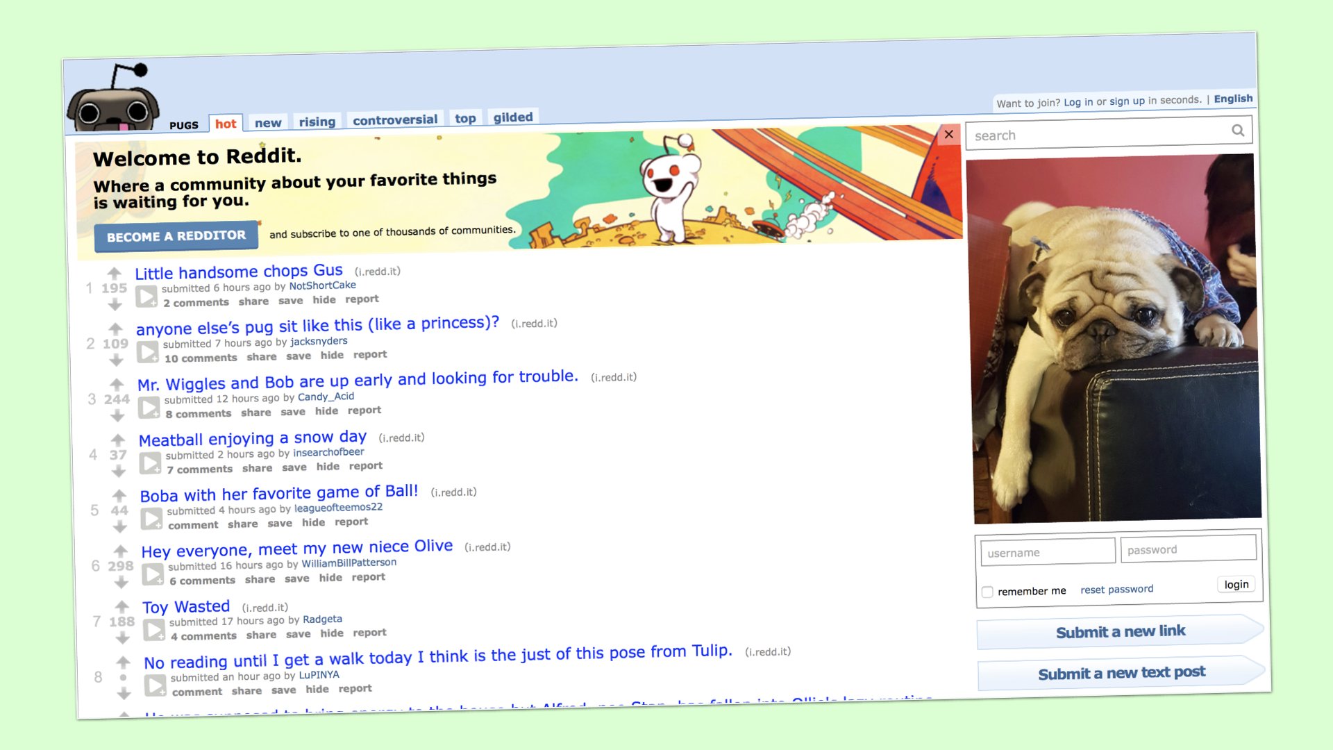
But what are they, really?
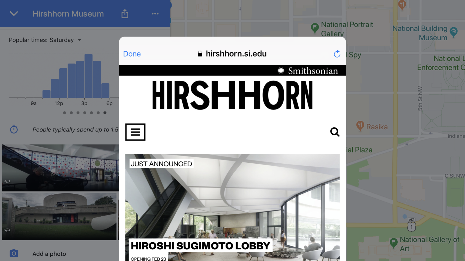
This is a website. It’s in a web browser, inside a modal window…inside the Google Maps app…on an iPad. It’s certainly not what I imagined while using my dial-up modem on a 13″ CRT monitor in the 90s.
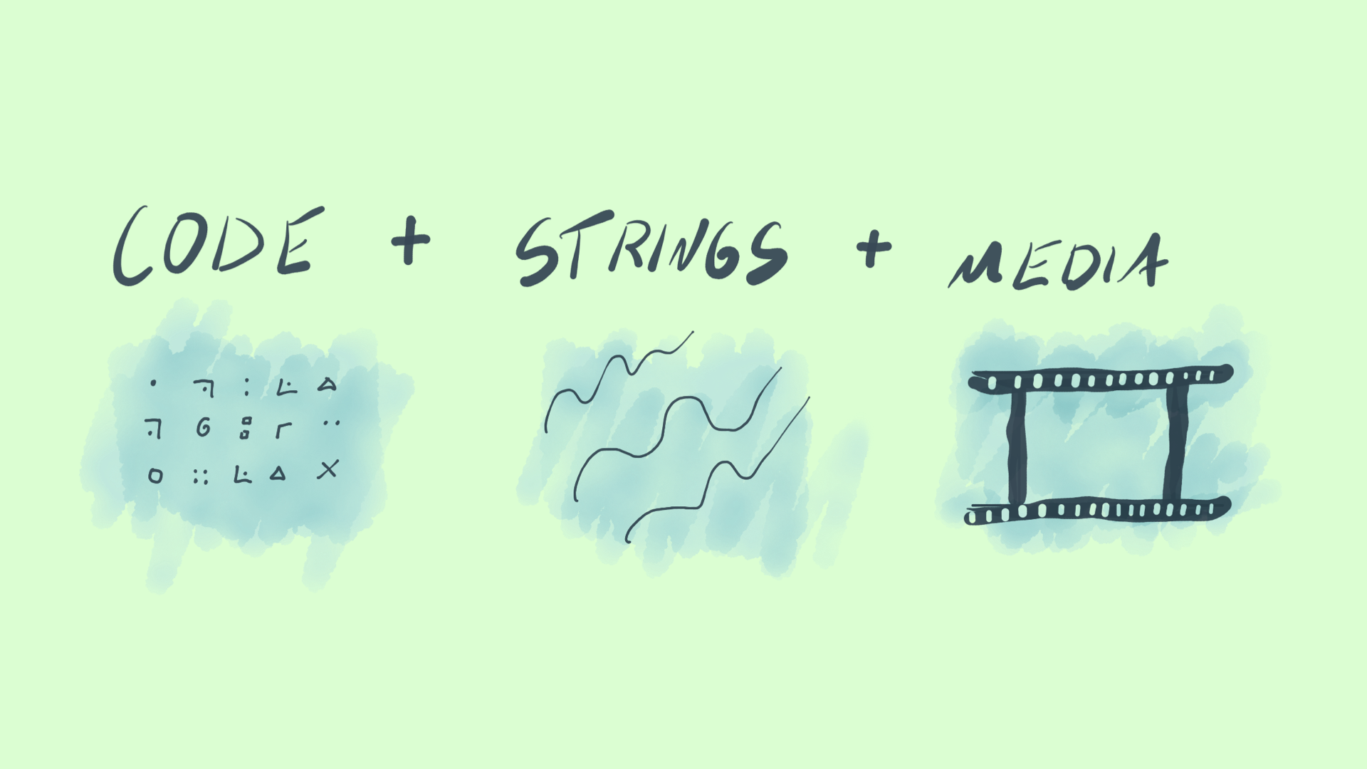
Sometimes we define what things are in terms of what they’re made of.
A website is made of code, strings, and media. People forget about the middle one a lot, which is why I have a career.
And we often divide the work along these lines — engineers, writers and marketers, designers.
But a table is more than wood and nails. And a website is more than code, strings, and media.
Because websites can be so many things to so many people, we need metaphors to answer the question. Metaphors aren’t true. But they can be true enough to be useful.
I have seven metaphors to share, seven answers to this question.
You’ll think of your own, while I talk. I suspect there are dozens. Hopefully, one or two will provide a new way of understanding how your stakeholders, colleagues, or audiences think about your website.
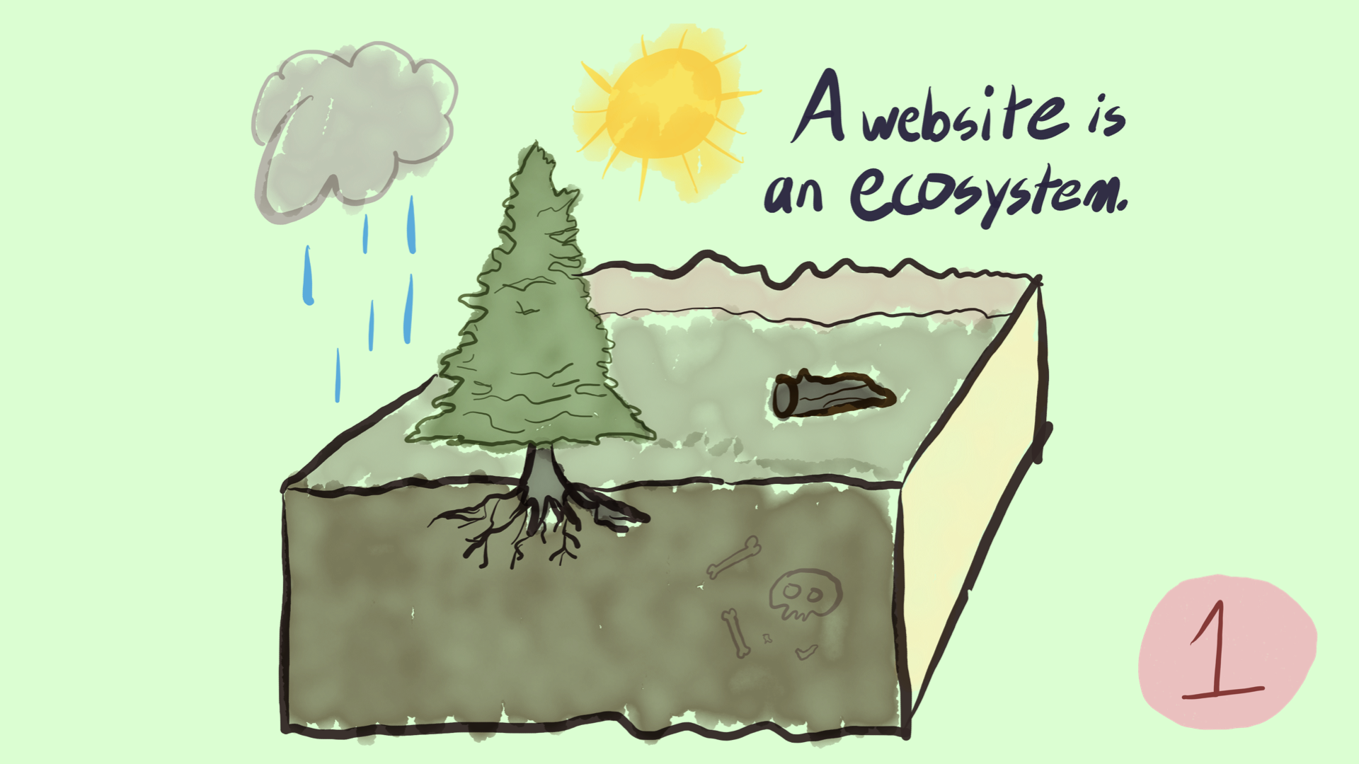
I’ll start with my personal favorite. A website is an ecosystem.
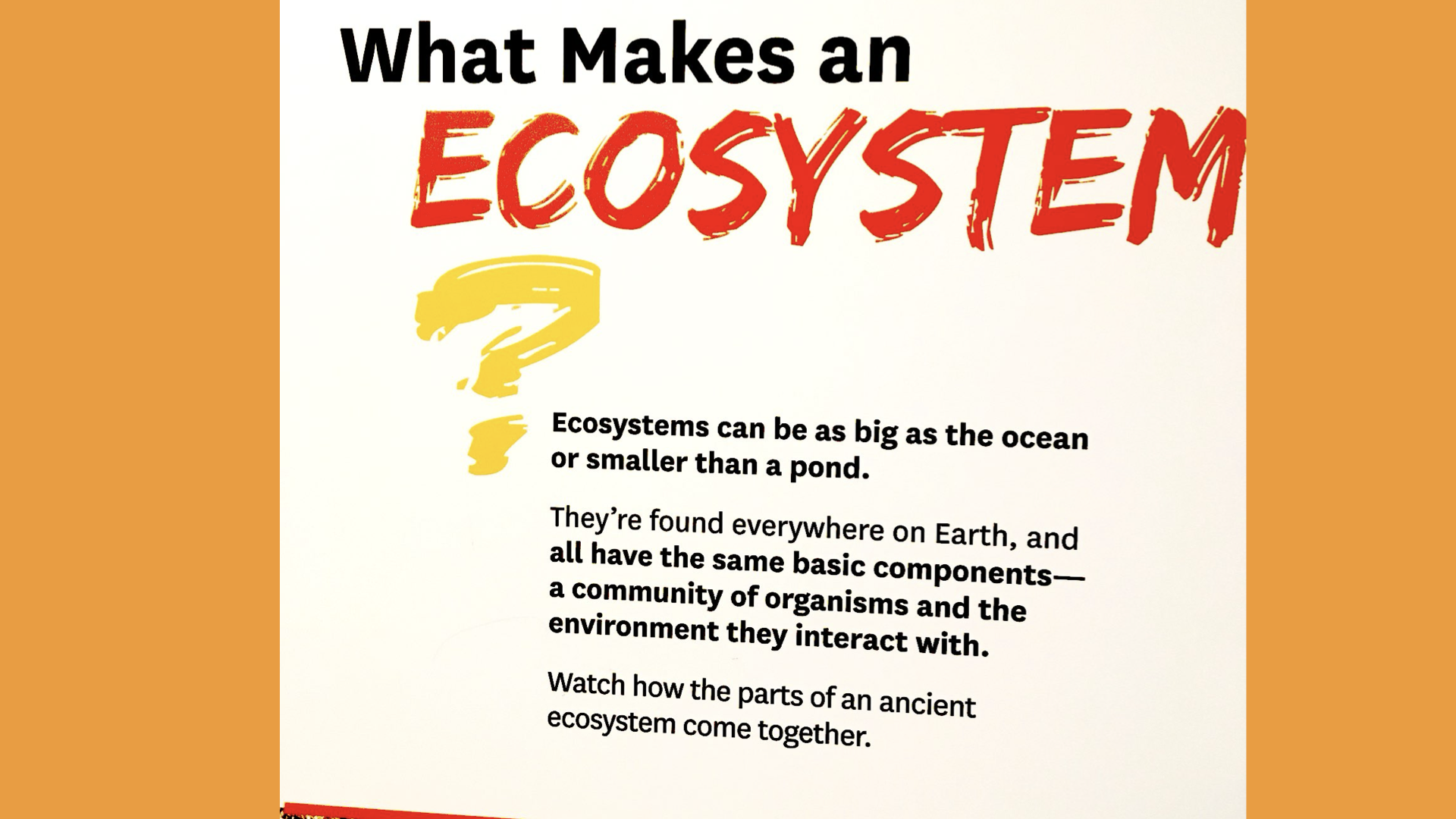
Here’s a great definition on a sign at the Natural History Museum.
It talks about how ecosystems are “a community of organisms and the environment they interact with”
So it’s not just the organisms. And it’s not just the environment. And it’s not just the interactions. It’s all of them, together. I think websites are like that, too.
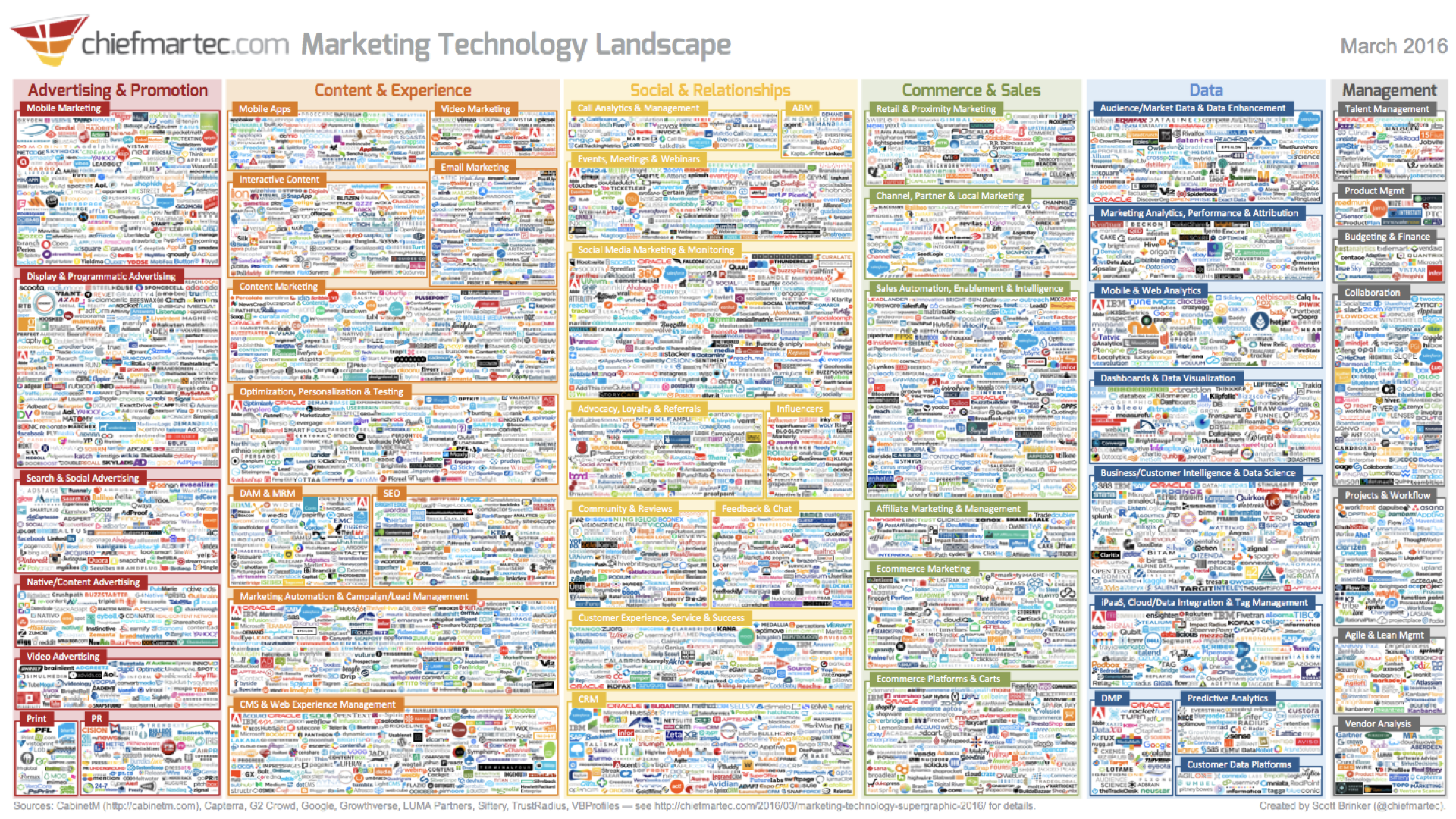
Often, when I ask clients if they have a map of their ecosystem, I get something like this. A big list of channels and technologies. Not this big, but close.
But lists are not models, nor maps.
Where are the people, the organisms? Where are their interactions?
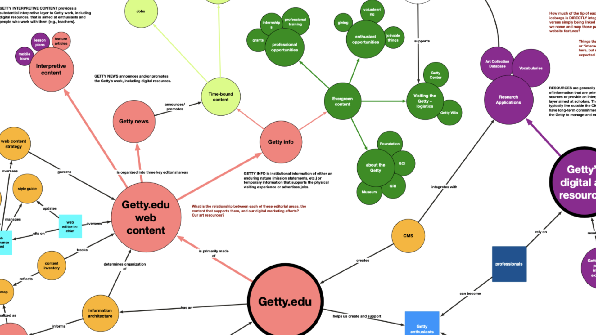
Excerpt of a content ecosystem map made in collaboration with a team from Getty, via this case study.
Many teams don’t have a clear conceptual model of what their website is, how it fits into their overall web presence, and how it does or should support their business operations and user needs.
Large organizations often struggle with content ownership, but ownership of what, right? That has to get defined first.
The ecosystem maps I make with clients are not sitemaps. They connect teams and people, audiences, systems and rules, topics and storylines, brand values and business goals, all together, on one canvas, to model the interactions, context and relationships in their digital presence.
This approach helps identify gaps, articulate goals, and build a shared understanding of your content reality. It’s also a way to play with possibilities in an afternoon, rather than over months of speculative design work. Move circles to move worlds. See what you can make.
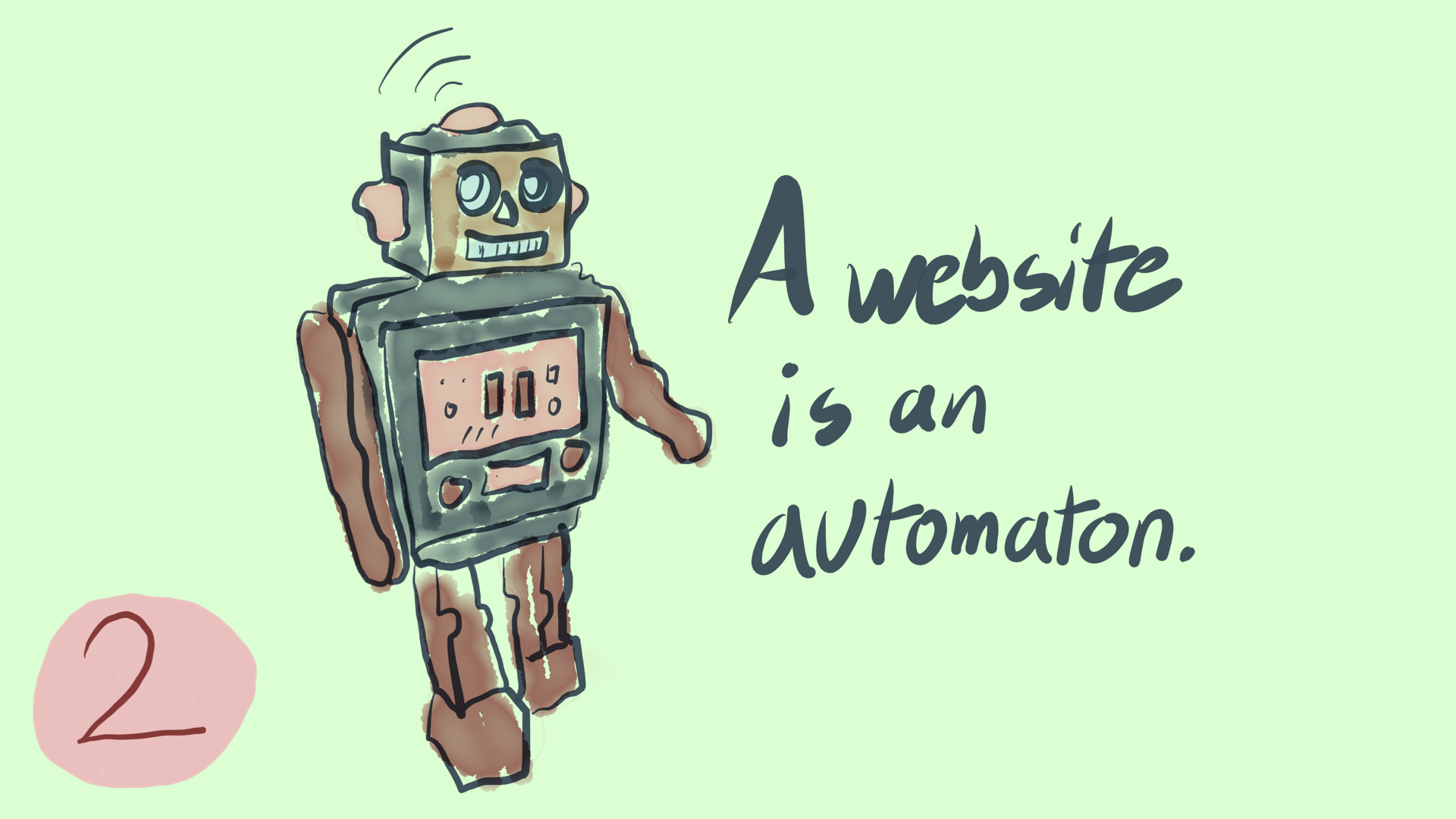
Number 2: A website is an automaton.
Defined as: “A moving mechanical device made in imitation of a human being.”
Consciously or not, we imitate humans in our designs because we’re humans, and humans will be using it.
We’re not designing for whales, or Martians.
This metaphor drives my UX writing course at the School of Visual Arts.
Designing interactions based on how two humans would relate in this situation solves many content problems before they start.
It also gives us inspiration to draw from: What if my website were a bank teller? A guidance counselor? A tour guide? A salesperson? What if they were cheerful, or encouraging, or matter of fact?
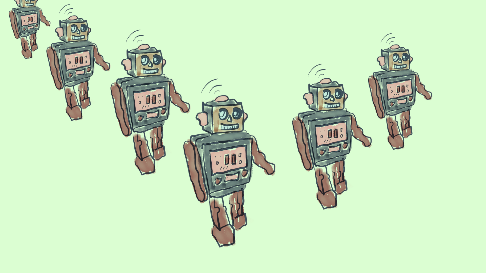
Big sites rely on many automatons, working together.
This is also like the real world. You ener the store and talk to a greeter, then a sales associate, then a clerk, and, if something goes wrong, maybe a manager.
The hand-offs between these roles are critical, and a place where we need help from our service design and content design friends.
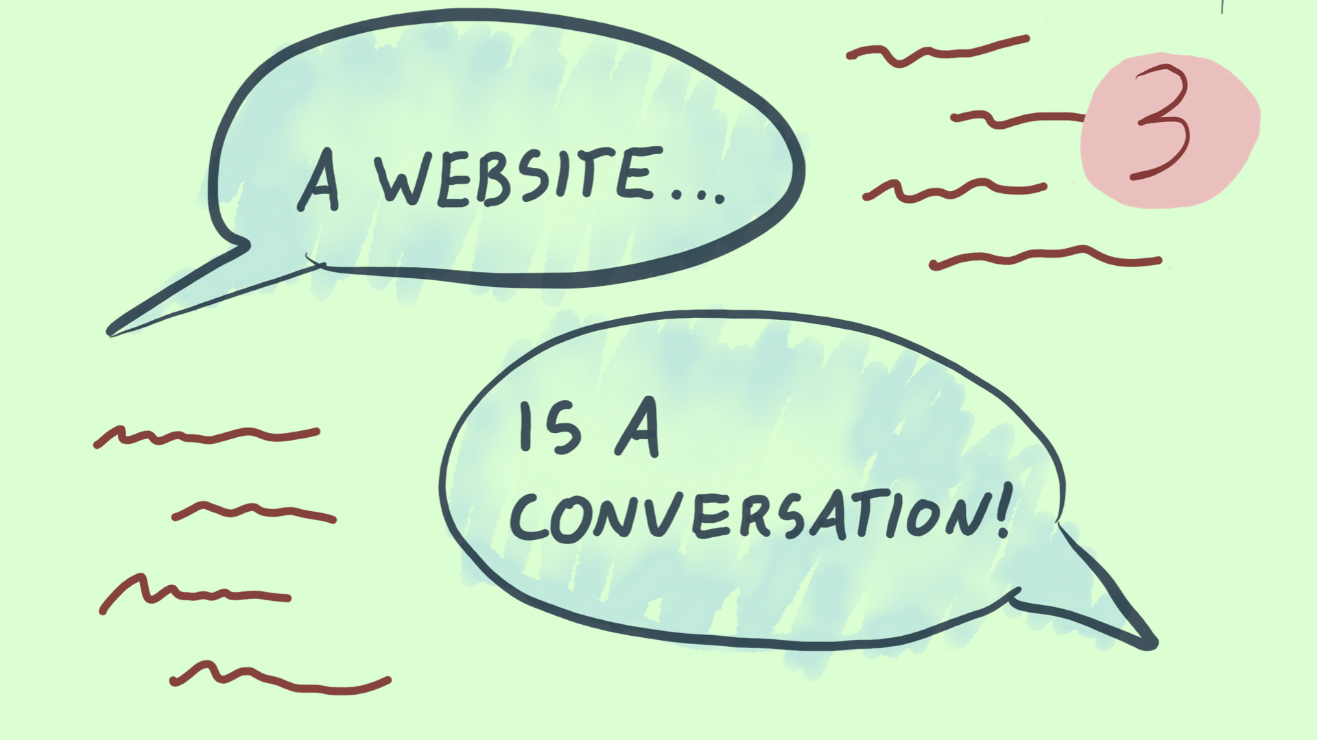
Speaking of content design, number 3: A website is a conversation.
We’ve built a machine in imitation of a person. How do people interact? Conversation is one of our most oldest methods. You don’t need a chatbot to design in a conversational way, just imagination. Most digital interactions are already conversational. (A few aren’t — sometimes the metaphor of a cockpit or control panel might be more appropriate. But most are.)
Conversation is an art form, and a deep well of inspiration. I often use human relations principles — etiquette, manners — to make design decisions.
If it would be rude in a conversation, it will be rude on your website.
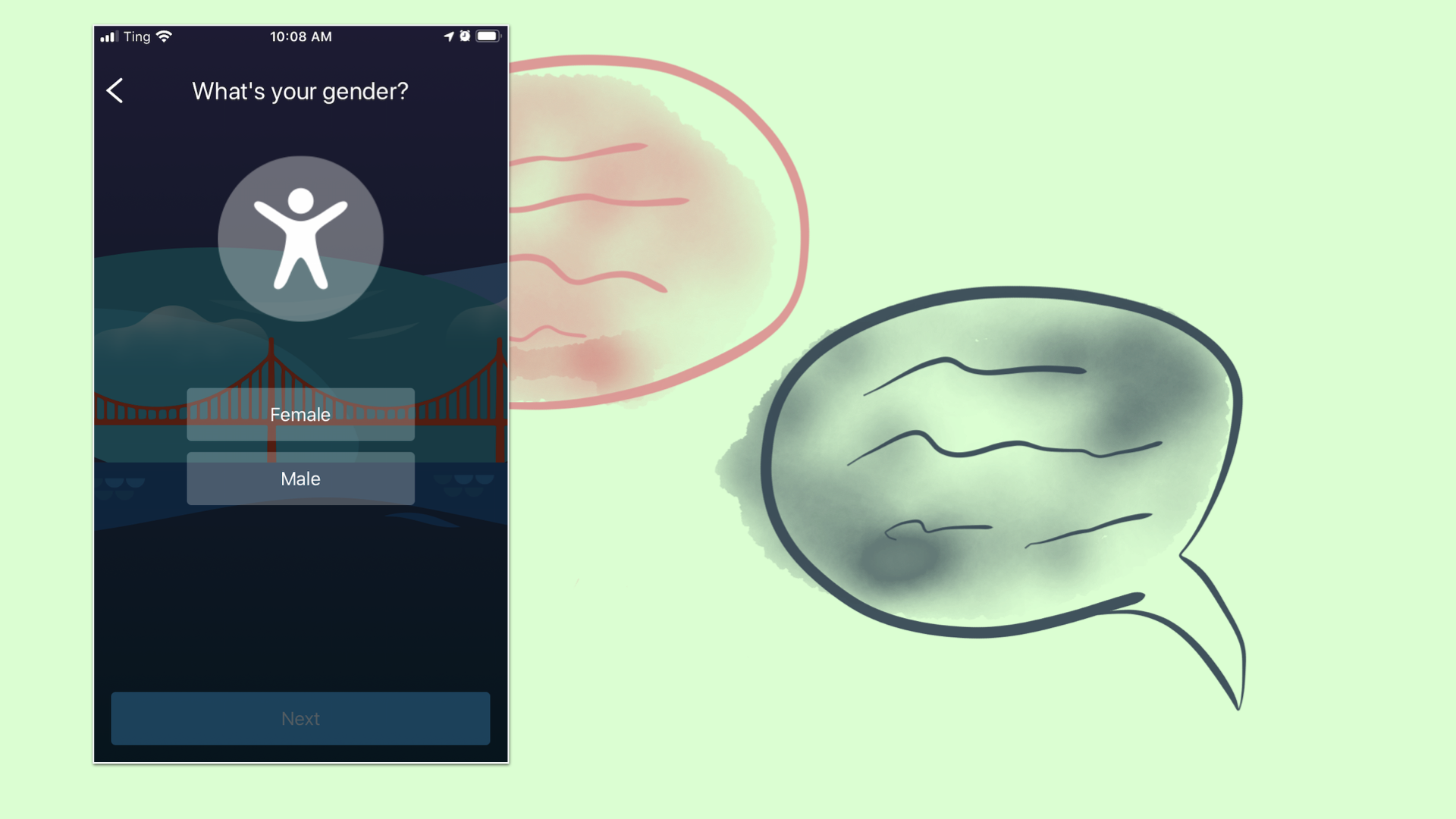
“Hi, great to meet you! Do you have male or female sex organs? And what’s your credit card number, by the way?”
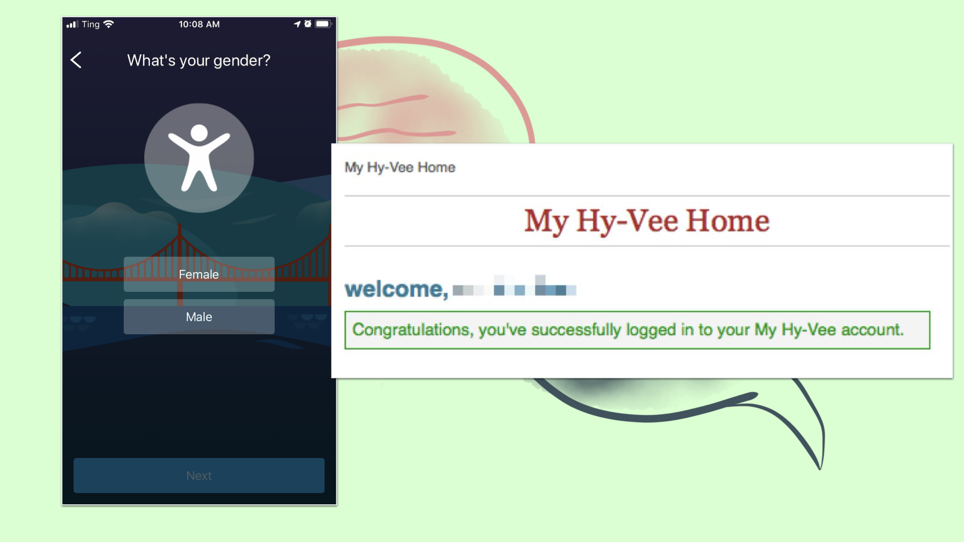
“Welcome, friend. Congratulations, you’ve successfully logged in to your My Hy-Vee account. Let’s break out the champagne!!”
Conversations can be…Pleasant…Efficient…Terse…Awkward…Funny…Successful, or unsuccessful.
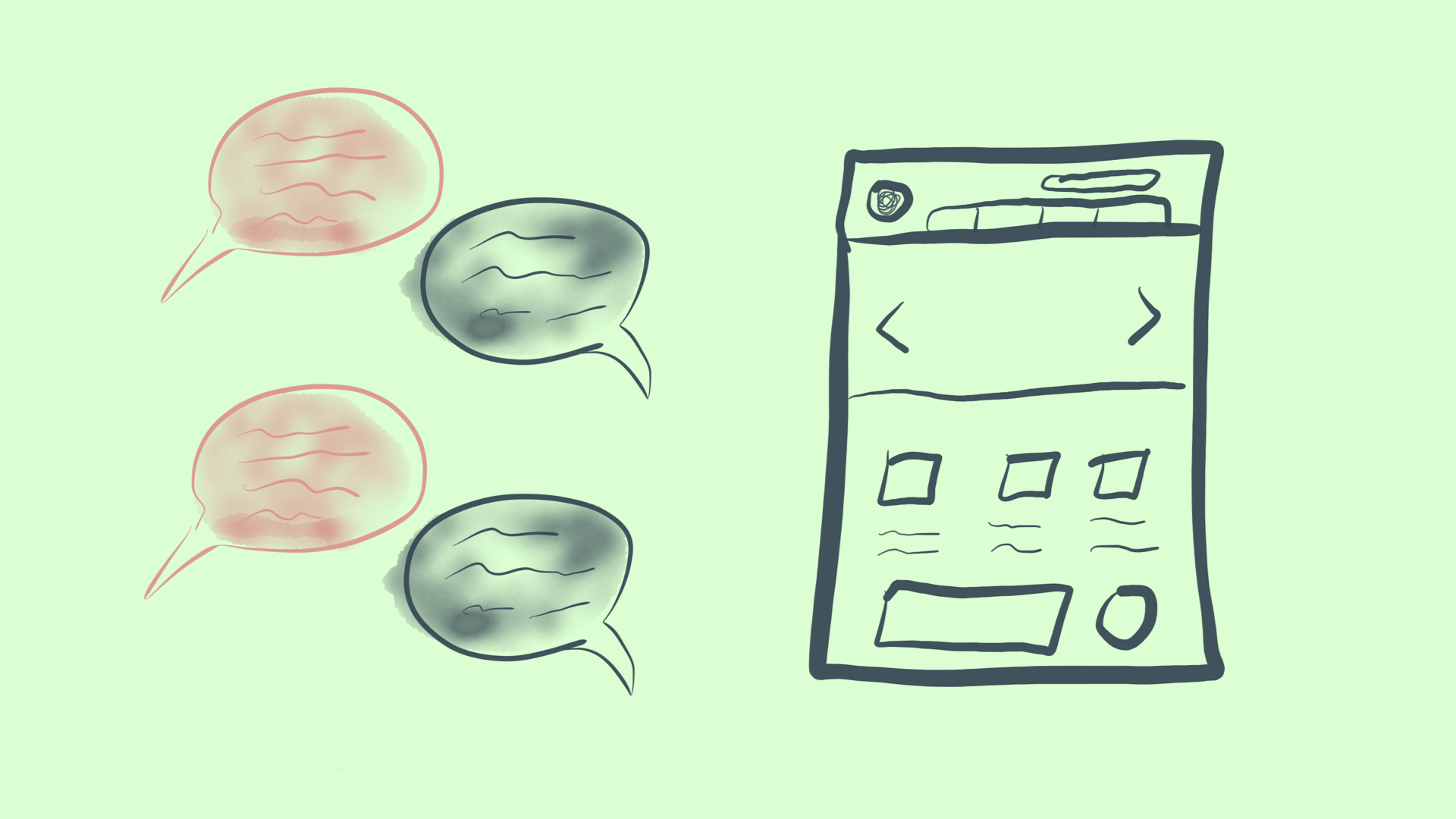
I ask you to consider: If a website is a conversation, why not design the conversation first? And the boxes and arrows second?
There are whole design approaches that start with designing the conversation, and if your team hasn’t tried it yet, give it a go. Write the conversation first, then figure out what needs to be a button, a menu, a field, a link. Writers can and often should lead design. You can prototype with words.
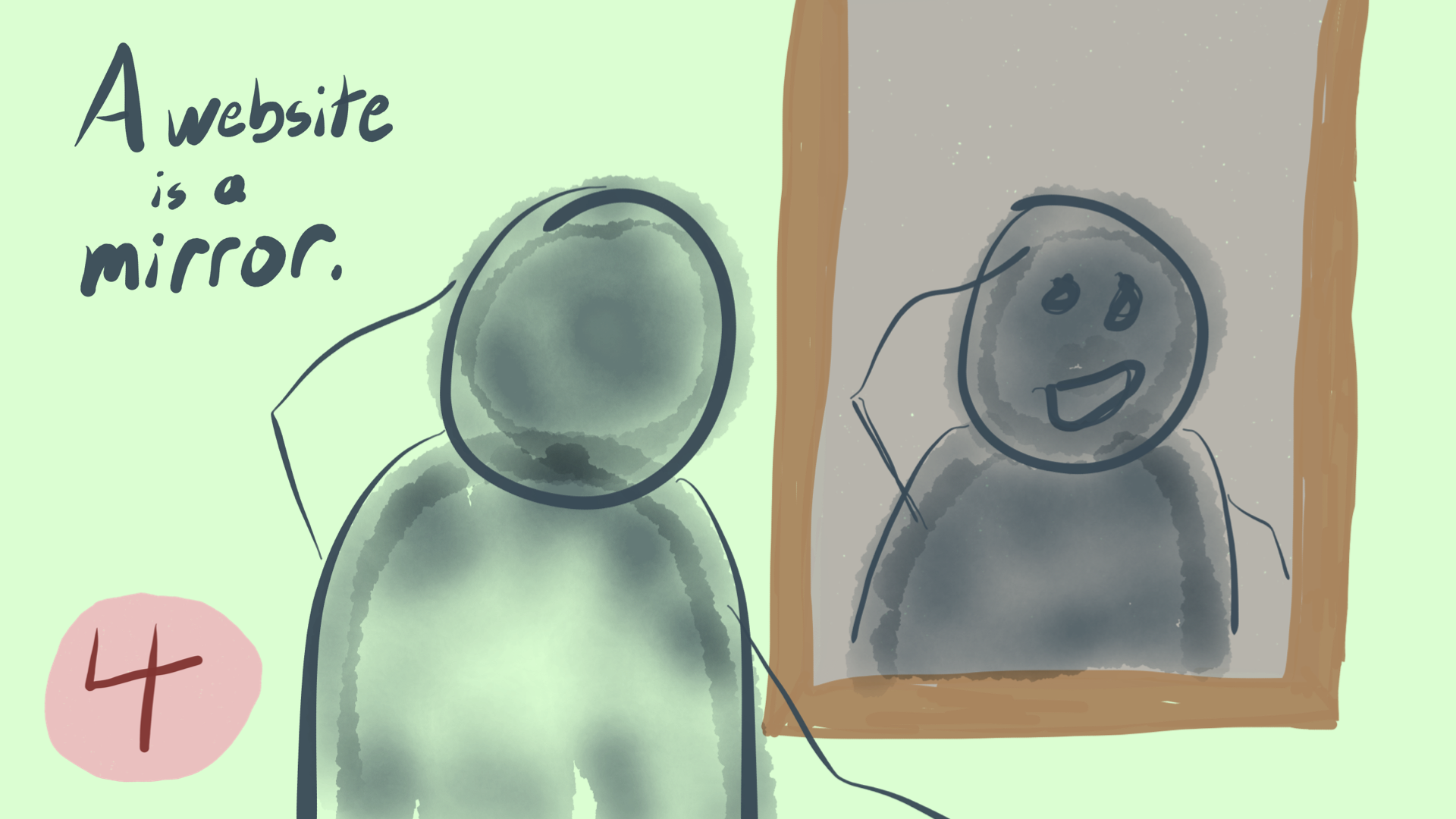
Number 4: A website is a mirror.
I don’t need a mirror to know that I exist, but it’s reassuring nonetheless. Many teams, and especially many business leaders, rely on their sites as sources of truth. If it’s not on the website, it’s not real — like with the Air Canada executives.
This sometimes results in “org chart design”, where teams try to reify the abstraction that is their business operations by mapping it onto their IA. This is bad.
For many people in your audience, there’s no distinction between your brand, your company, your website, your social media, your other website, the chatbot inside the website … it’s all just … you. A mirror of your organization.

I like to remind clients that your navigation bar, your major landmarks, tell a story about what’s important to you. No surprise here from the IRS. File. Pay. And, yeah, sure Refunds. In that order.
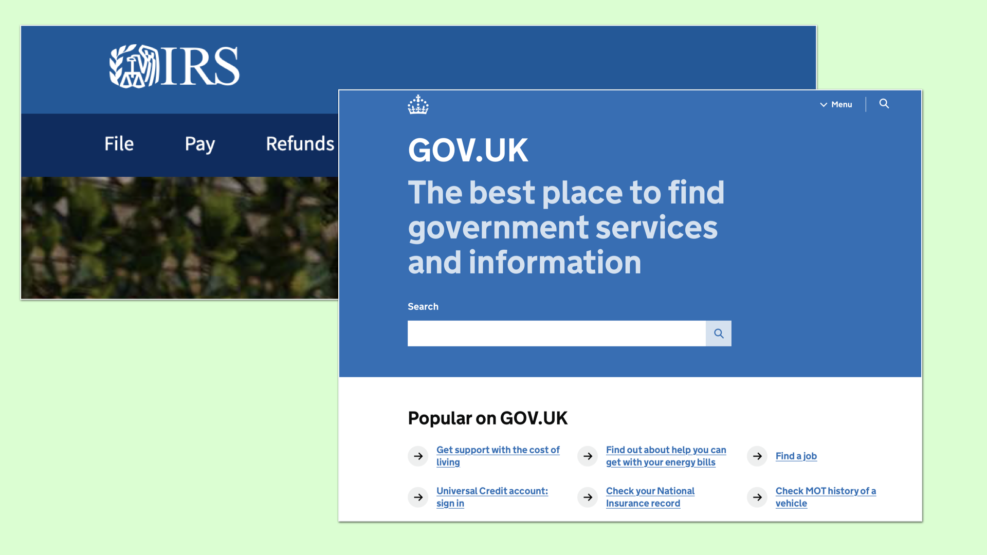
No visible menu when you land on Gov.UK; instead, search. To me, this says: “What’s important to you is what’s important to us.”
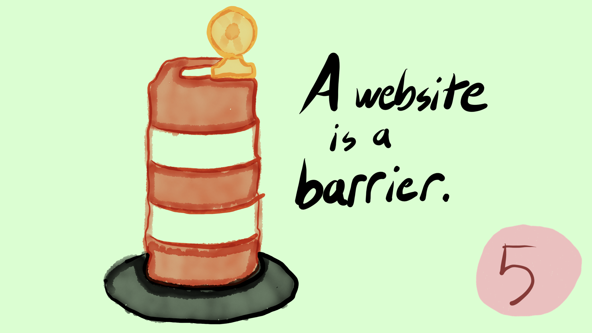
Number 5: A website is a barrier.
This isn’t me trying for brownie points with the accessibility crowd. It’s true, many apps and sites contain barriers for people who use them differently than the people who designed them. But I actually think websites themselves can be understood as a barrier, in general.
It’s something that exists between users and what they want.
This is the primary mental model many users have about your website. It’s just some damned thing between them and what they want.
No one wants to go to the DMV. But I also don’t really want to go to Zappos.com. I want shoes. I don’t want to go on IMDB, I want to be someone who knows how tall Tom Cruise really is. (Five seven.)
If you really want to delight users? Help them get off of your website faster.
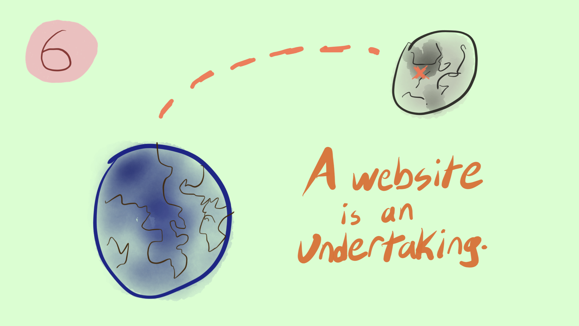
Number 6: A website is an undertaking.
Undertaking is word you use to describe a great journey! A grand aspiration!
It’s a thing that requires massive planning, resources, help and operational support.
But we don’t tend to talk about websites that way. We talk about “projects” and “redesigns” and. Temporary things, brief things. God forbid we acknowledge how big of an effort it really is to run this thing.
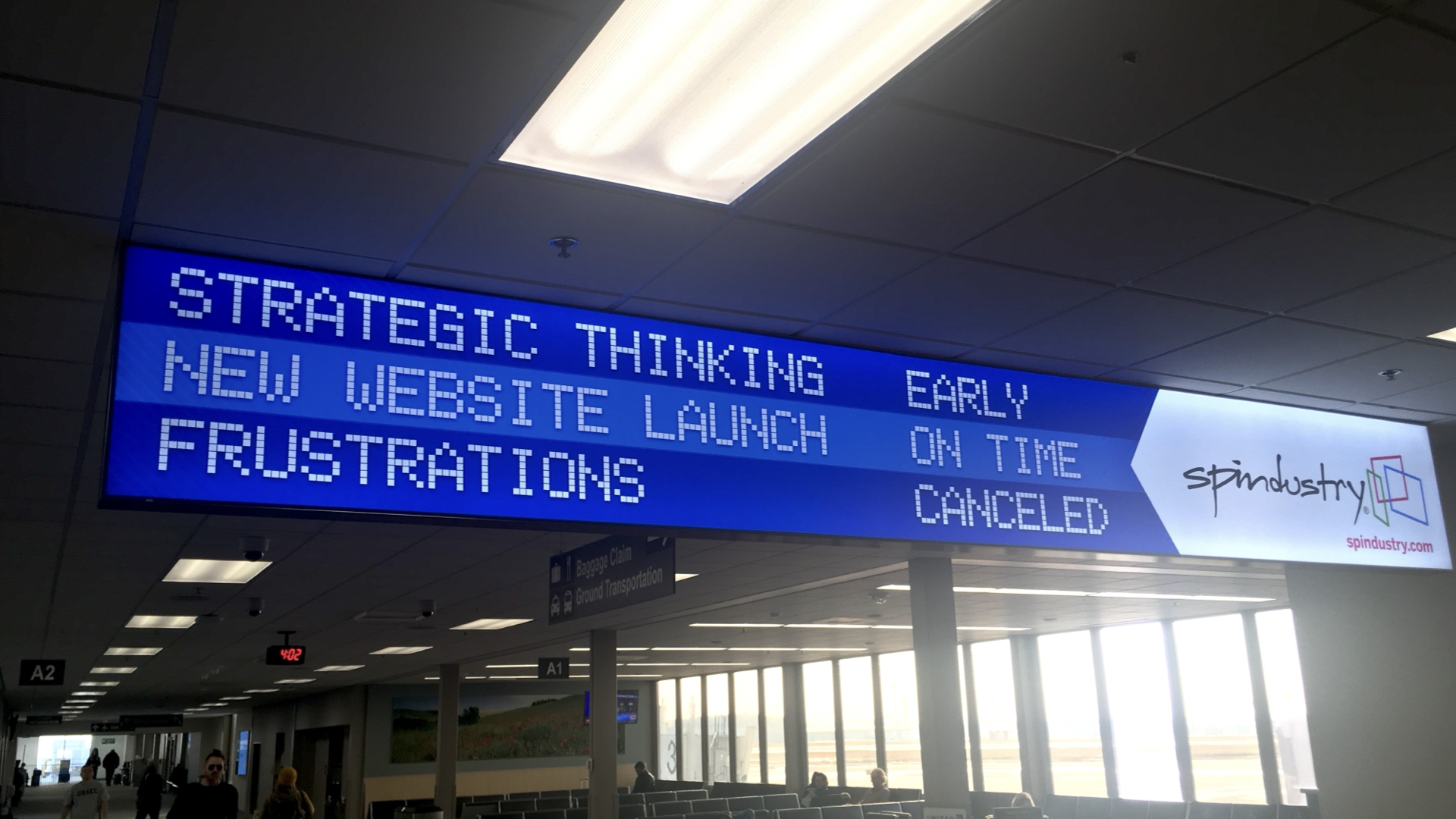
Or — my pet peeve — we talk about launching and relaunching websites, like rockets. I find all of these words insufficient.
We needed more than a rocket to land men on the moon … let alone get them home again.
The launch isn’t enough. You need the scientists and researchers to plan it, the specialists to train the crew (ahem), mission control to guide them.
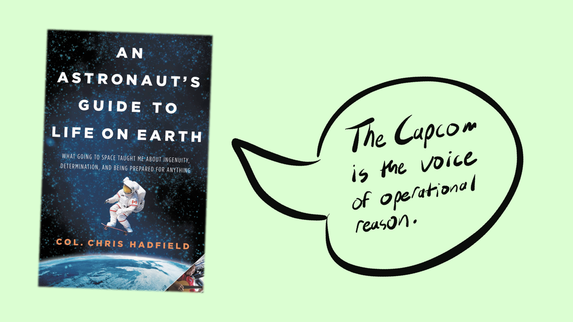
In this book from astronaut Chris Hadfield, he talks about his time as CAPCOM in Mission Control, and how having been to space made him better at that job.
He describes capcom as the “voice of operational reason”. I’ve often tried to provide that, as a content strategist.
He goes on to say: “The job is an endless challenge, like a crossword puzzle that expands as you fill it in.” Sounds like a website to me!
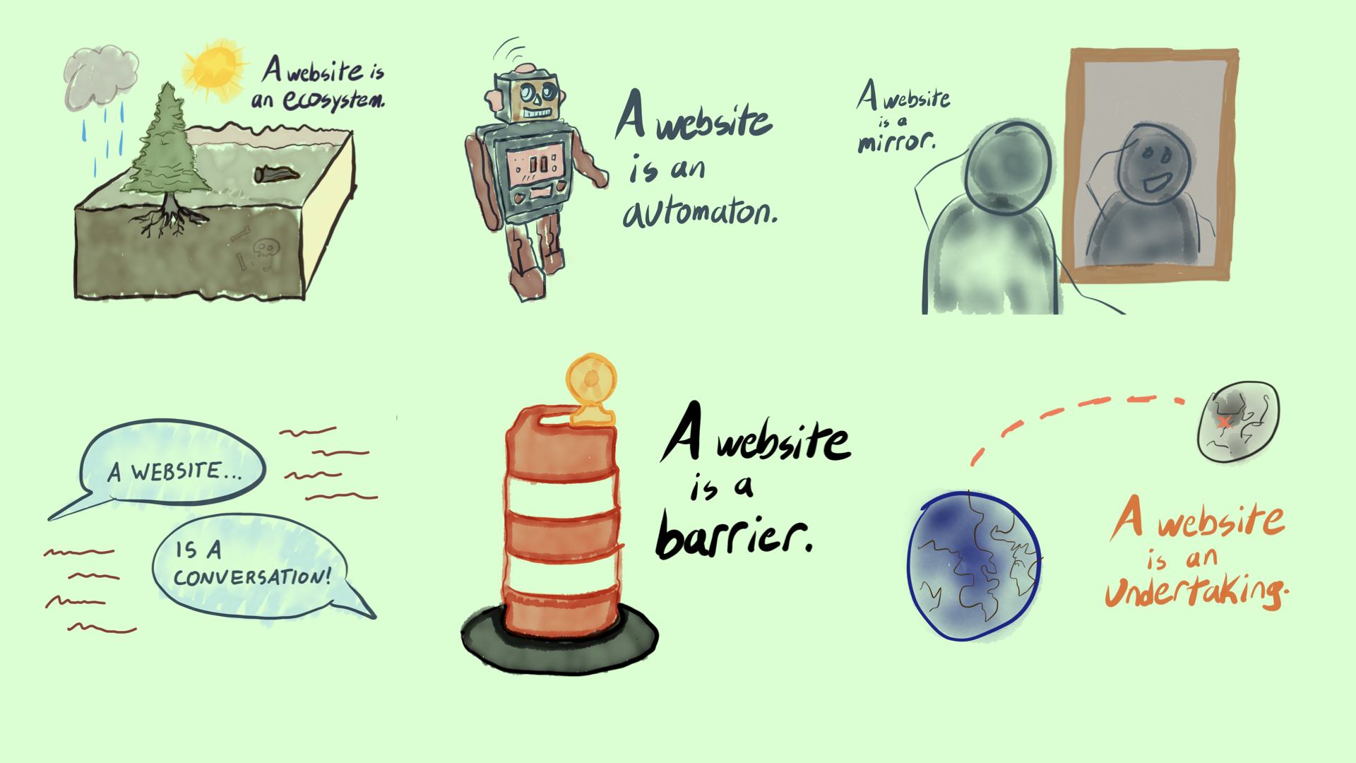
We have six metaphors so far.
And because a website can be all of these things, to all kinds of people…there’s one more way I invite you to think about a website.
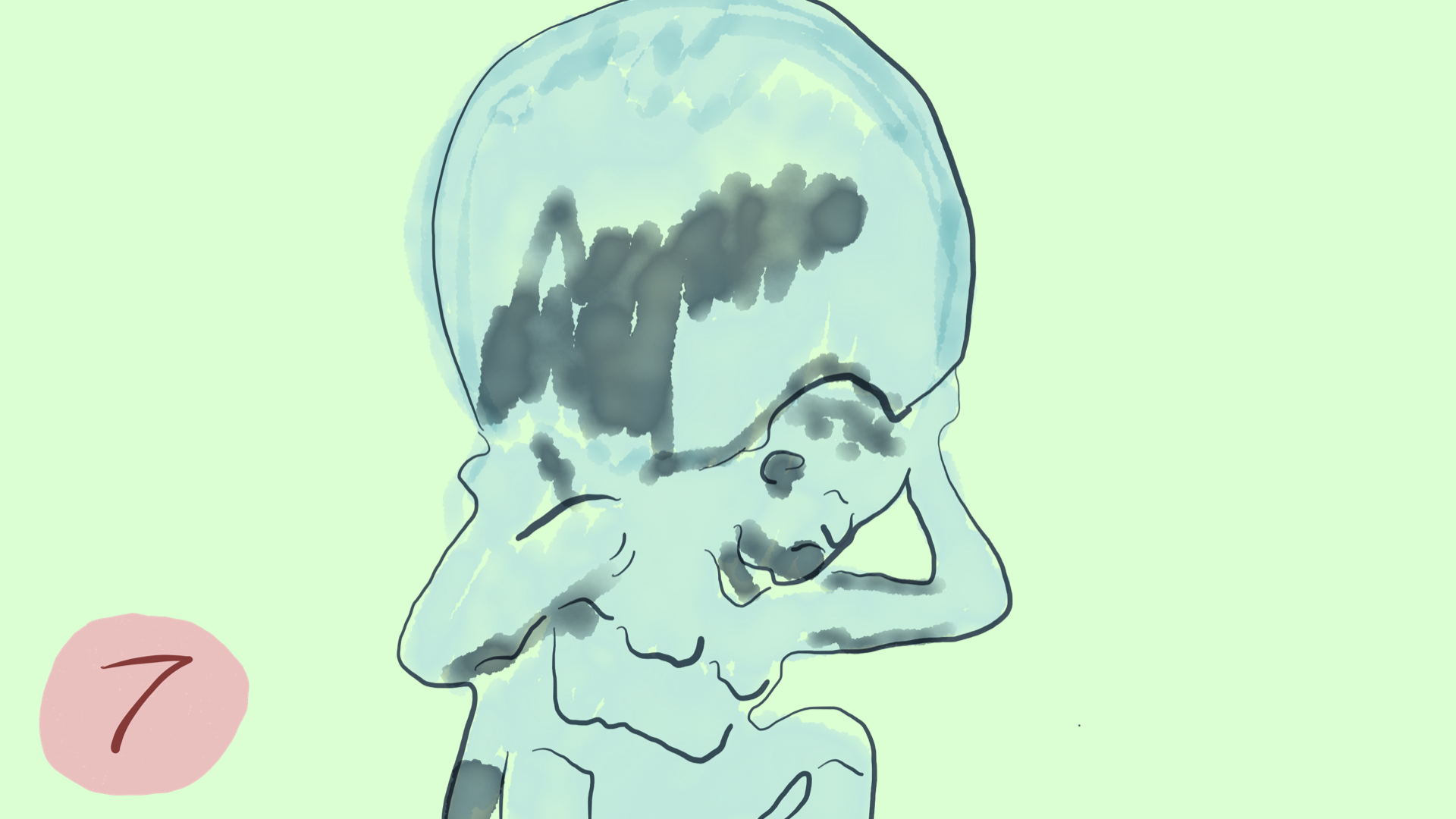
A website is a responsibility.
To operate one creates responsibilities to the people who rely on it, and to the people it’s meant to serve.
Like anything else we put into the world, websites can affect people we never thought of, in ways that we never imagined. We have a responsibility to those people, too.
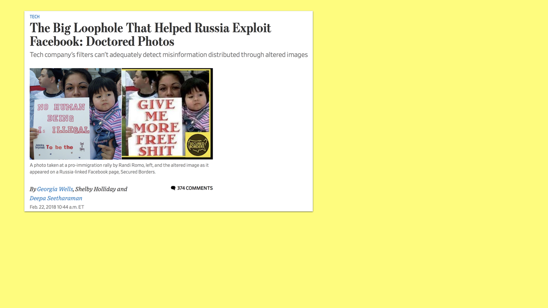
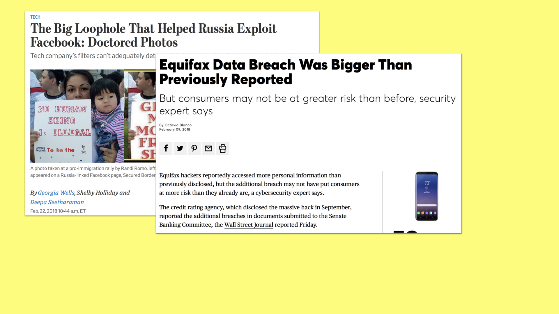
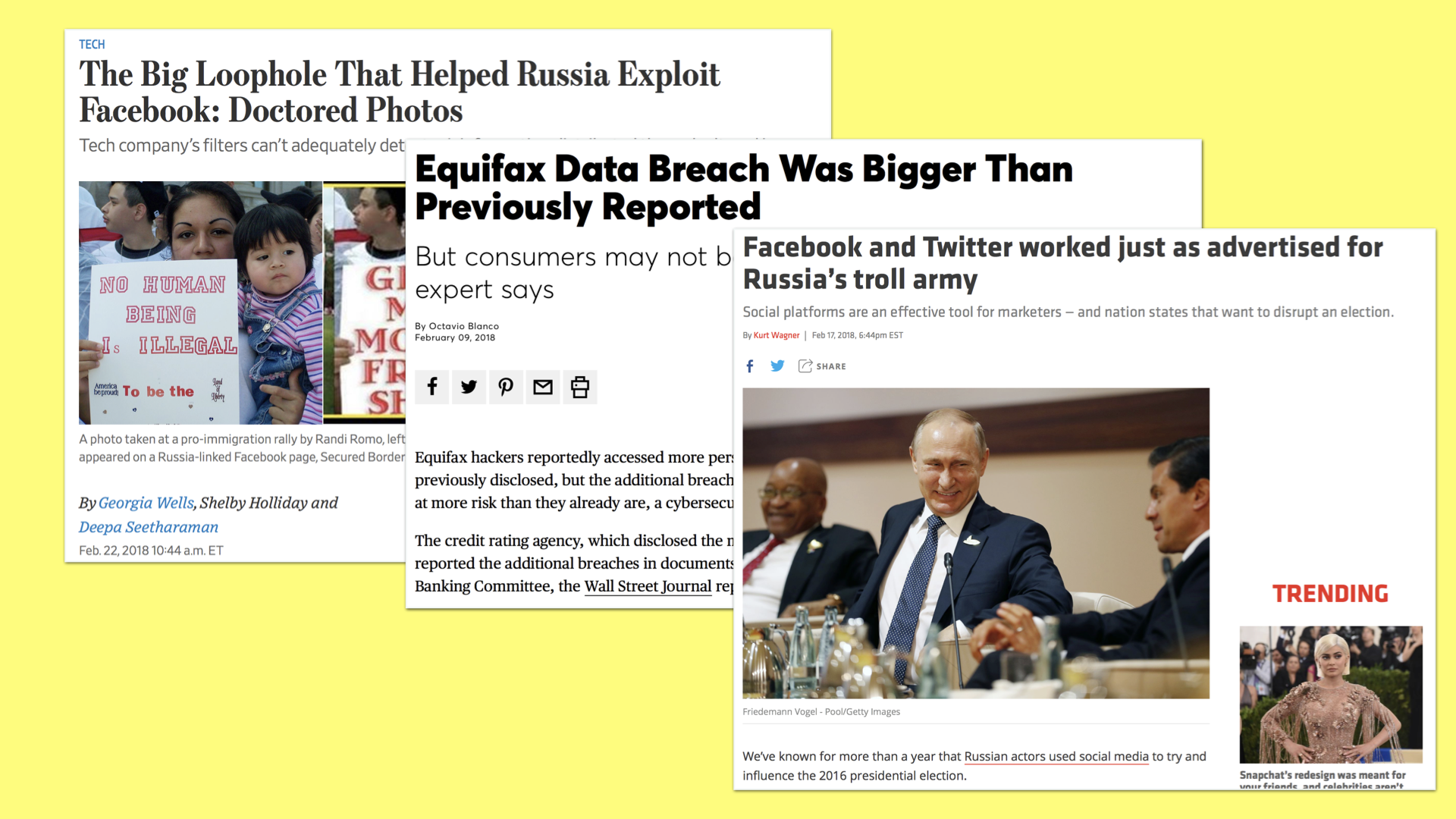
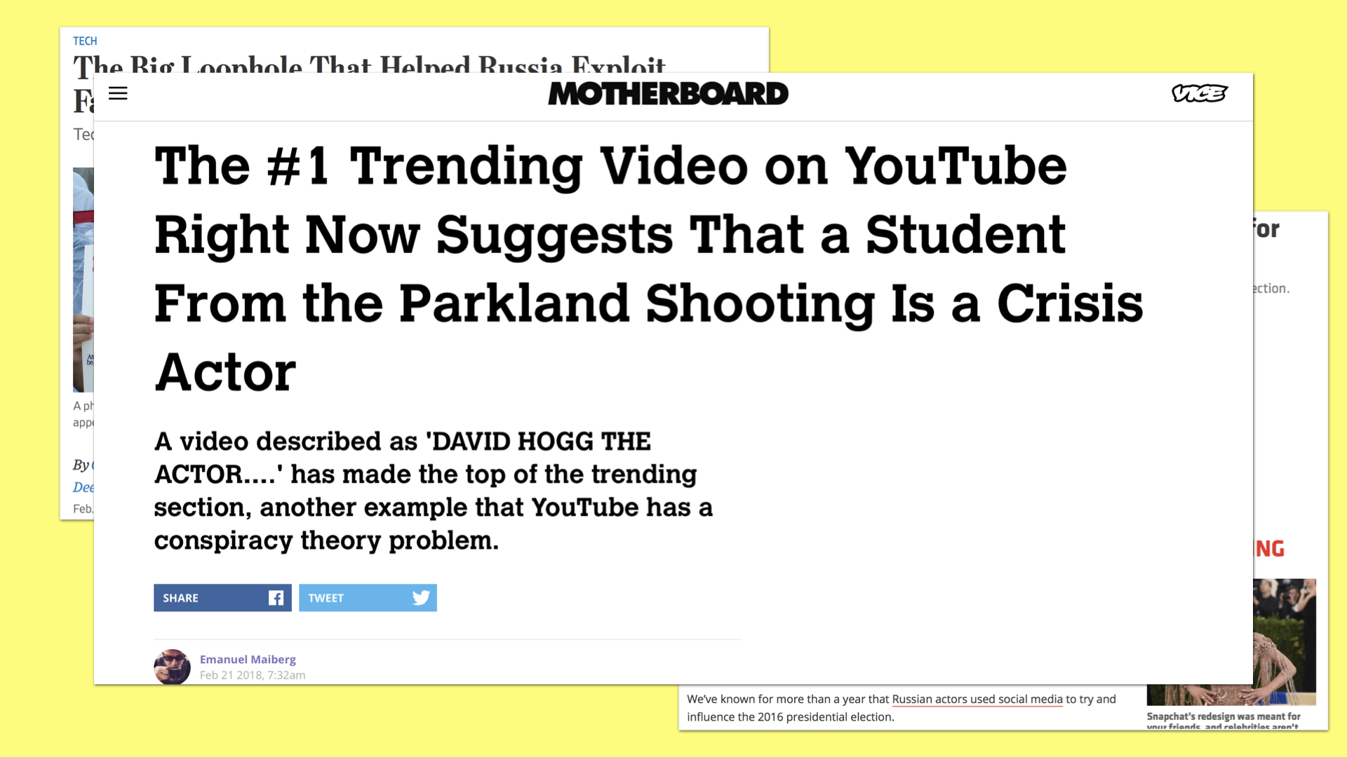
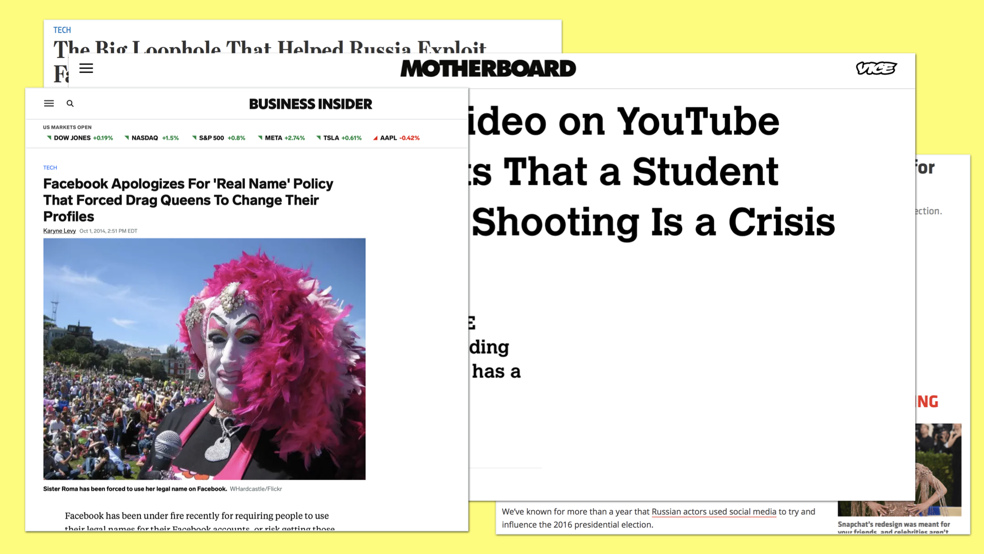
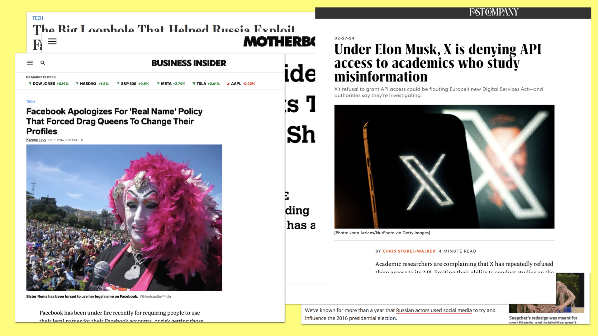
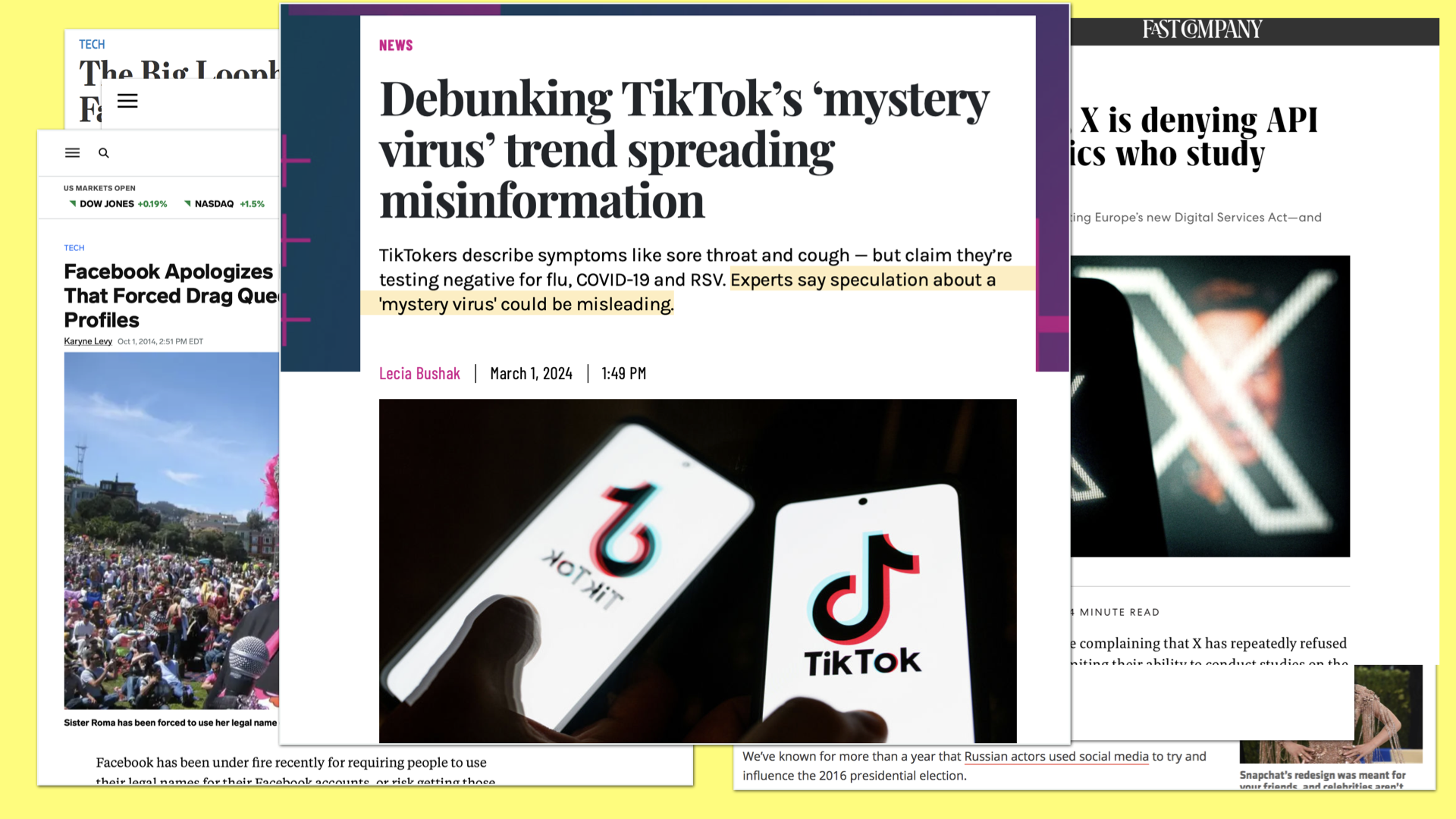
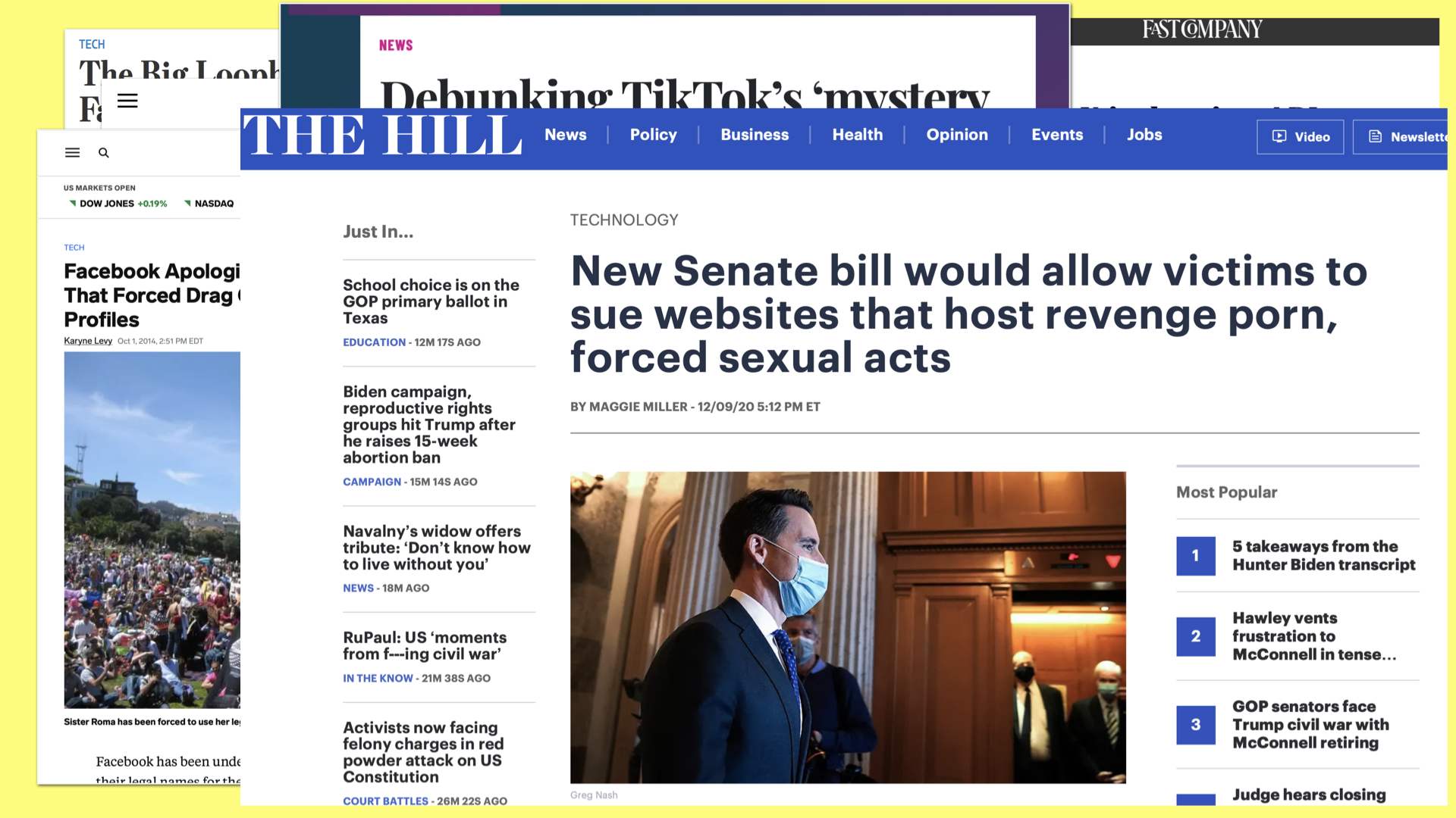
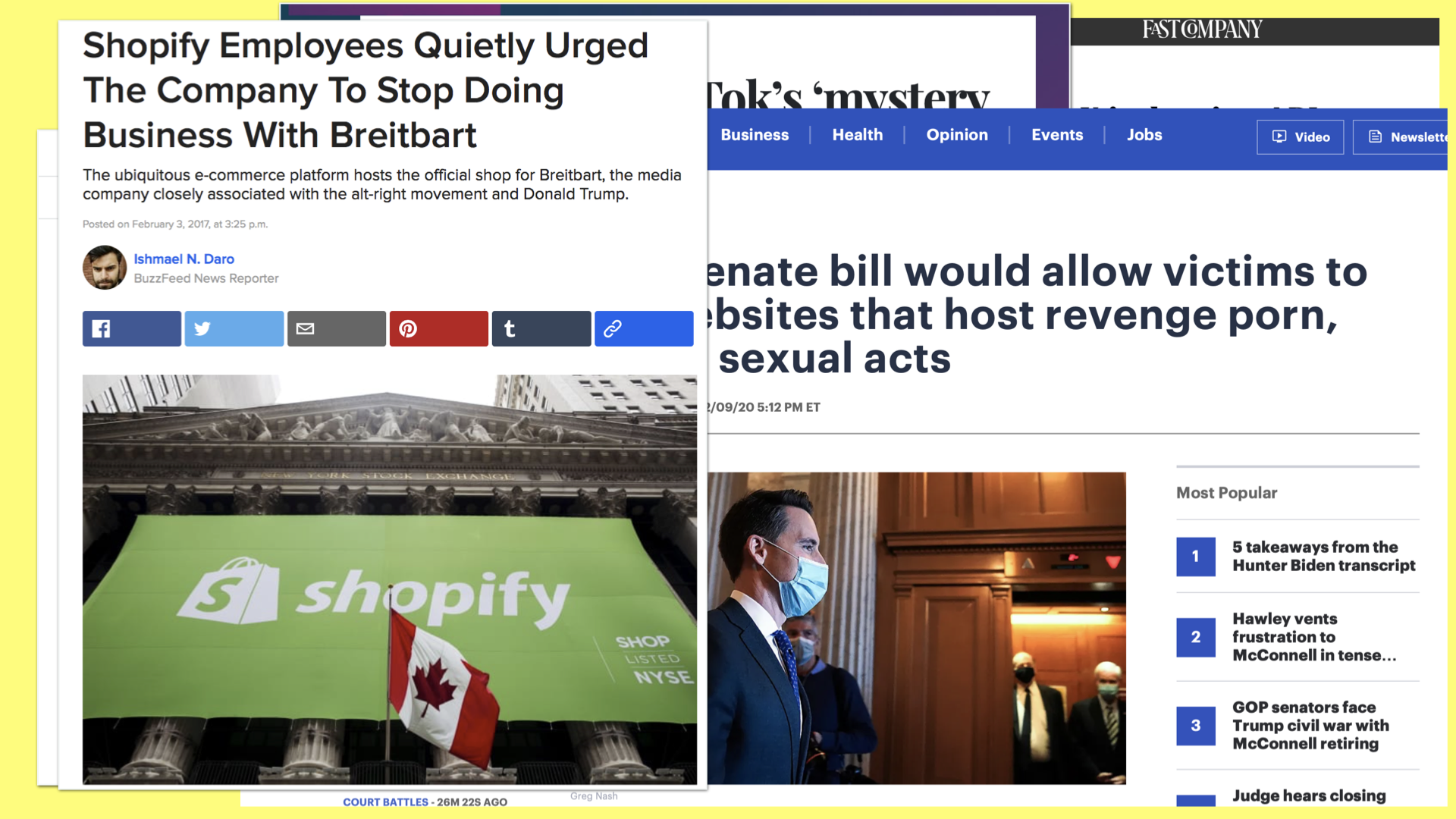
Those might seem like some extreme examples, but these kinds of stories are becoming distressingly common.
I share them to emphasize the stakes, and to encourage you to consider what stories about your brand, your site, your work, that you hope to never see in the news.
Be good.
Do good.
I’m rooting for you all. Thank you.
