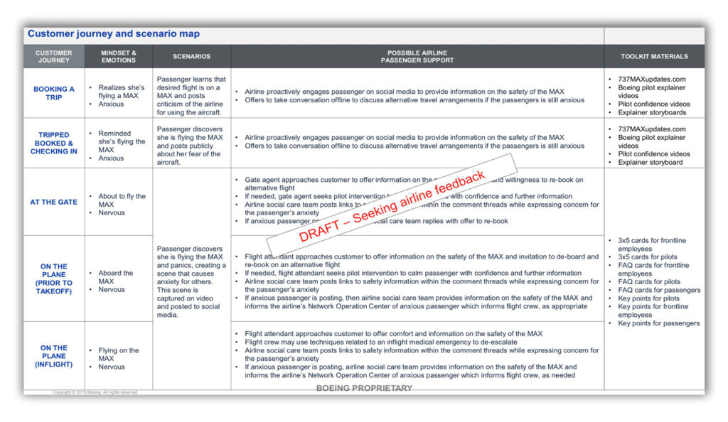
A bit jarring to see one of the tools of my trade — customer journey maps — pop up in this article about the 737 Max and Boeing’s efforts to manage customer “anxiety” about their totally safe airplane that’s killed 346 men, women, and children. (So far.)
I’ve been trying to imagine how it will feel to have worked on this when the next one crashes, to have employed “human-centered” design techniques to gaslight people about the safety of an airplane that you, the UX designer, have fuck-all first-hand knowledge of. It seems not great! I’ve created my share of design tools and frameworks and it would make me just sick to my stomach to see something I’ve made weaponized like this against users.
Meanwhile, this nonsense:
[A] company website dedicated to updates on the Max was being designed with “improved usability” and “stickiness” to “encourage more time on site and repeat visits,” phrases commonly used in the communications business.
Repeat visits! LOL. Love to bookmark my favorite websites about airline safety and check back often for updates.