Corey Gwin is building a writing app called Blurt. To promote the app, he’s been writing about writing. To promote my book, I’ve been tweeting about writing. I tweeted out one of the things he wrote, which made him notice me, and then he asked me to do a video interview for a series he’s…Continue readingInterview: The Write Stuff
Tag: design
The system is a lie
I’ve always been enamored with product ecosystems. It’s rare that I’ll buy anything without researching what kind of accessories I can get with it. Does it have an official case, pouch, or sleeve? Can you change the tip, the handle, the grip? What can I upgrade? What can I combine it with? LEGO was both…Continue readingThe system is a lie
Introduction to Writing for Designers
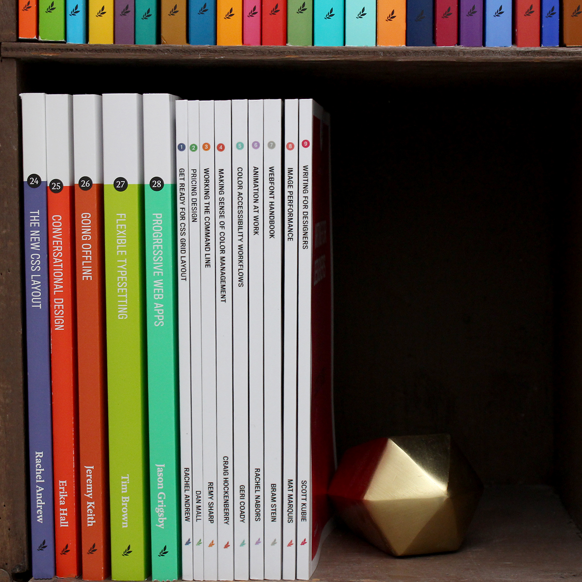
The introduction of my book Writing for Designers is available to read for free on A List Apart.Continue readingIntroduction to Writing for Designers
Links of late | 2018-06-01
New version of Ulysses is out. Lucky 13. Nothing I’ll make immediate use of but I see the appeal of the colored keywords, especially for a larger project like a book. A recent episode of 99% Invisible about Curb Cuts jumped right into their top ten for me. Design, usability, political activism, shitting on Jerry…Continue readingLinks of late | 2018-06-01
One my favorite talks I give is about making Dale Carnegie’s 9 Golden Principles for Being a Friendlier Person an accessible idea for UX designers. The first principle is often one of the hardest to adhere to, both IRL and on the web: Never criticize, condemn, or complain. When a user does something we perceive…Continue readingstopit, Golden Principles, and the Golden Bridge
Sometimes words are best
I like when designers solve problems with words in a straightforward and simple way. I nearly opened the wrong end of this carton of heavy cream. But then I saw the all-caps instructions to OPEN OTHER END. So I did. Not hard to imagine a designer using an illustration (which you’d probably decrypt right after…Continue readingSometimes words are best
Change management example in Overcast
There’s a lot to like here. Clear heading. Shows up immediately, full screen. The pre-selected path (to remove your email address) adds privacy and is user-focused. It explains what the email address is for in simple language, right there on the same screen without having to go anywhere else to read anything. Love it.Continue readingChange management example in Overcast
The content doesn’t “live” anywhere
Found notes from a Donna Spencer workshop on information architecture I took back in 2012. I paid out of pocket to attend and though it seemed a small fortune at the time I’m very glad I did. On where content “is”: I don’t talk about where things are in a site because they aren’t anywhere.…Continue readingThe content doesn’t “live” anywhere
Starting in the middle
When I know what I want to say I start at the top-left corner of the page. “Dear Sir or Madam, I demand satisfaction!” When I don’t know what I want to say — or even what I think — I start in the middle of the page. Then I can go up. Or down.…Continue readingStarting in the middle
Ting follower numbers in navigation
This is on the main nav of the Ting website. I like how the follower numbers are displayed — it’s a nice way of adding a wee bit of persuasive rhetoric to a limited space. It doesn’t just say “please follow us” but rather “Join the 123,000+ other people that have already decided to follow…Continue readingTing follower numbers in navigation